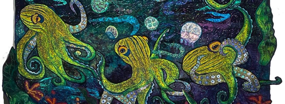
We’ve been talking about the variability of the zigzag stitch in free motion. Most of the time, I’m filling in a space where I want a line of color to show up. This is a trick that will give me a soft blend of color across the image without a hard line. I’ve heard it called the long stitch, although the old-fashioned description you hear with free motioners is the long short stitch. As with all free-motion zigzag stitching, the difference isn’t a setting on the machine. It’s how you move your fabric through the machine as you’re stitching.
Most of the time when I’m filling a space, I stitch a zigzag line at an angle around the edge, I shade the piece by stitching from side to side, and then I smooth the edges with a zigzag that moves straight through.
But when you just move from side to side you get a long blending stitch that flows into itself. The breast of the bird is done from side to side. The feathers are done with an outline, shading, and smoothing. You can see the difference.
I almost never do bed quilts. I did them when I was younger and watched them die as I used them. It was too depressing. I occasionally will do a baby quilt or a comfort quilt for someone dealing with illness. Mostly I do art.
And since art doesn’t have to be big, I don’t often make something bed-size to put on the wall. Except when I do,
This heron couldn’t be done smaller. At least I couldn’t do it smaller. He’s 60″ x 52″. He’s pretty much the size of God’s underpants.
There are some strategies for dealing with overlarge quilts. The first three are, don’t. But if you’ve decided it must be large, there are several things you can do that will help.
Strategies for Large Quilts
Break it into components. For myself, that means the embroideries. I do them separately and then apply them when the top is ready. But it might be working in rows or in segments. Different quilts will suggest different approaches.
Use larger details. Scaling up the design means there’s less work in it. Sometimes extensive detail just looks ditsy on a larger piece.
Buy extra sewing machine needles. Larger quilts require more tugging and pulling and that will break needles. Promise.
If you have a machine with a wider arm, this is the moment. The arm of your machine is the space between the needle and the mechanical right end. A lot of manufacturers make machines with a longer arm. That’s extra room to shove the quilt through the machine. It can be very helpful.
Use a design wall where you can walk away and really see your design. A design wall should be big enough to accommodate your work and in a big enough space where you can walk away and really look at it. For more information about making and using a design wall, here’s a blog post on it: Studio Essentials: The Glories of the Design Wall.
The other helper is what we used to call bicycle clamps. Roll your quilt, clamp them with these clamps and then you can maneuver it easier.
I don’t do large quilts often. But they do really make a punchline in a gallery show. So this heron is promised to a show at the Peoria Art Guild in September. We should have him crowing by then.
Free motion stitching is versatile. One of the graces of working free motion is the effects you can get with the stitching, just out of the angle your fabric goes through the machine. It’s about filling in space.
I’ve been asked by someone to do a flamingo quilt. I’d been hesitant in general to quilt flamingos because they’re a signature piece for Ann Fahl who won at Paducah with an astonishing work called Flamingo Garden. I haven’t wanted to step on her turf. I hope she won’t see my working on a flamingo in that way
But as soon as I started to look at flamingos, I was hooked. The colors are eye-popping, after all those properly grey birds and they are outright silly. I’m in love.
So I drew up three flamingos bathing. These are much smaller birds. They’re around 18 inches as opposed to 40″. Their impact is different and the coloration on them has to be different. It makes sense. If you’re filling in less space you have to cut out some of what you’ve used to fill in a larger space.
There are several ways to do that. One is to use fewer colors. When I choose colors, I choose the darkest of the base color, then a shader color, a range of the base color dark to light, a shocker, and then the lightest of the base color. That range can be massive. It’s not at all uncommon for me to use 60 colors in an image. But for these little birds, it has to be less. I ended up using about 20 colors
The other way to expand the space is to use a smaller zigzag.
Finally, I used a straight stitch instead of a zigzag stitch for the detail overlayer.
Every piece is different: in size, in coloration, in stitchery. But I’m pleased with these little birds.
Nothing is quite as daunting as a really large embroidery. This babe is almost as tall as I am (4′ 10″). I haven’t measured him yet, but he doesn’t fit on a yard of fabric and we’ll have to sort that out soon.
Part of what is daunting is seeing the whole on a piece like this. Part of it is that when things go through that awkward half-embroidered stage, they look really weird for quite some time while you’re finishing off.
I’ve always made a point of showing you all of my errors. Partially because I view that kind of honesty as helpful and partially because I don’t necessarily view them as errors. They are the path through that particular piece of art. Sometimes they even turn out to be helpful.
I finished binding one quilt in a bright green in the middle of working on this quilt. Went back the next morning, and finished a large swath of feathers, only to find they were that very bright green. I was appalled. I picked up the mustache trimmer, looked at the immense patch of green, and quailed.
Then I thought for a while. Part of the problem with herons is that they are mostly grey and dark blue. With bits of rust. They are exquisitely formed but the color scheme leaves much to be desired.
But what is grey? Any color can be made into grey either by adding a lot of white or a lot of black. It’s a matter of value.
So I gathered up all the colors I had that were the same values, not colors. I added a lot of rust that gives it a warmer color, which means I’ll need a background with warmer shades as well.
All those colors sort of made it rainbow-colored. And rainbow colors make iridescence. But since they’re the same values, it’s still greyish. I think it’s going to be all right. I’ll know in several days when it’s all stitched in.
A word about the photography. I just got a new to me iPhone 12 mini. I do think the pictures are an improvement. Let me know what you think.
If you’d like more information about ripping with a mustache trimmer, see the blog To Rip or Not to Rip.
Years ago someone asked me how many mushrooms go in a quiche. I asked back, “How many mushrooms do you have?”
I don’t make copies of things. I do make variations, and I find it useful to rethink some things I’ve done before, or more importantly tried to do before. I might get lucky. You never know.
But there are some things I know I can always use. There are never enough dragonflies, daisies, frogs, or mushrooms. They make an excellent point of interest for a visual path through a piece. And every so often I make batches of them.
The last two quilts had lots of frog and mushroom action. But they are such different pieces. Why did that work? Why do the same color elements work in two really different color backgrounds?
I’ve thought about it a bit and have decided that bright is a color all of its own. Green Heron Hunting features a bright fall-red sky, a stream, and some rocks. High Rise Living is a soft-colored background as a garden with lobster claw plants dangling in the breeze. The backgrounds couldn’t be different. But both backgrounds are a strong contrast to the mushrooms and frogs. High Rise Living is almost pastel. Green Heron Hunting is a bit somber. Both of them are high-contrast against the backgrounds
Batching regular elements has changed my work a lot. I find I can do larger elements with much less distortion. The downside is they need to be stitched down afterward. The mushrooms get stitched down with the most prevalent color on the edge. The frogs and other elements usually get stitched down with black. I don’t always like the heavier black borders, but it eliminates a lot of pucker and distortion.
So I continue to make batches of the elements I know I’ll use again and again, Contrast, any contrast makes elements work together. And there’s always room for one more frog.
I don’t follow trends well. If it interests me it interests me. If it doesn’t, it’s background noise. So the snippet thing just went right past me. It’s an interesting technique, but it didn’t work with what I was doing.
So I was working on Green Heron Hunting and I needed to do something different with the leaves. I’ve often used green sheers with stitching to create folliage.
snips arranged on Steam a Seam 2
But I wanted fall leaves. Small fall leaves. I didn’t want them to be detailed. Just bits of color. So for this, the snippet thing made sense. I sat down with a pile of hand dyed scraps, and cut some bits. I cut a cloud shape of Steam a Seam 2. I arranged the bits on to the Steam a Seam 2 backing and pressed them on high heat with a non-stick pressing cloth.
The trick with a pile of snippes is stitching them down without them getting caught in the darning foot or having them go all over. I’ve seen snippets done with tulle over them to control the bits. Personally, I don’t like the look. I can always see the tulle. It looks either too dark or too light and it spoils the effect for me. So i decided to stitch them down with a top layer of dissolvable stabilizer, to keep things from getting tangled.
Dissolvable stabilizers have been around for a while. They are a film made from cornstarch and dissolve in water. They have a lot of commercial uses for computerized embroidery, but they also work well for free-motion embroidery. I don’t know that they stabilize so much as they keep the machine feet from getting tangled in the thread and bits of fabric. Originally they showed up in the 80s as Brama Bags, a dissolvable laundry bag for hospitals, where they were concerned about contagion from people’s laundry. It’s only gotten better since then. There are lots of different brands. The difference is in how thick the film is and how easily it dissolves. I like Aqua Film, which is now called StitcH2O, by OESD. But there are also Solvey, and Badgemaster and new ones come out all the time. What you are looking for is a film that’s steady enough to stitch over without being too thick. Thick ones take forever to dissolve.
That made a tree top I could iron onto the piece itself. But I never trust glue. It sometimes just comes loose. So it needs to be stitched over. And all those little bits of fabric, even glued, are going to go everywhere. So this is where I used my Aqua Film. I pinned over a sheet of the film, and stitched it with a zigzag stitch and a metallic green/brown Metallic thread calledFS2-20.
After all that stitching, I trimmed away any extra stabilizer.
I put it up on my photo wall, got out a spray bottle, and spritzed the stabilizer. It’s not instant. You need to get it really wet. But it dissolves. I put a fan on the piece and it was dry the next day. The color darkened a bit, but I’m still happy with the result.
So these trees work for me. The frogs and heron are so busy, there needed to be similar excitement going on up top.
I’ve also used dissolvable topping film for a technique I call globbing, where you stitch down a glob of thread onto a quilt. Just put the thread where you want it, pin the stabilizer on top, and stitch in circles until it’s significantly attached. They work well for stitching over delicate things like Angelina Fiber, where, again your pressure foot is likely to get caught. You can read about it in Another Fine Mess: Globbing, What’s on Your Floor
I am happy to announce two events. I have the first couple of showings I’ve had in 10 years.
Open Studio: Quilted Tapestries of Ellen Anne Eddy Saturday, August 27th Quilts, tapestries, books and hand dyed fabrics available for sale!
Hours:- Saturday 9AM – 3 PM Contact: Ellen Anne Eddy219-617-2021Galesburg Art Center, 309-640-0005
Birds of a Feather: Quilted Tapestries by Ellen Anne Eddy Cove Center, Havana, IL
The Cove Center, in Havana, IL announces Birds of a Feather, a show of quilted nature tapestries by Ellen Anne Eddy August 30 through September, 30th 2022. The Cove Center is in the Wahlfeld Building at 120 N. Plum St., downtown Havana Illinois. Hours: Monday – Saturday8 AM – 1PM CLOSED SUNDAYS ~Gallery Opening: September 2nd 4 – 8 PM Contact: Ellen Anne Eddy 219-617-2021Cove Center: 309-640-0005
Splash!
How do I feel about all of this? I haven’t hung a show in ten years. I’m past panicked.
Now, for an artist, panic is your friend. It’s the thing that helps you through the hoop of finishing, binding, hangers, signage and all the little details you remember the night before the opening. Along with raw terror, there’s all that extra energy if you can harness it. By now I’ve run out of steam and Steam a Seam 2 and most of my larger fabric chunks. My friend, Deborah Christman kindly embroidered a Don’t Panic towel In support.
But here’s the cool thing. I have, due to show panic and a small amount of hysteria, 15 new quilts and two new series to show.
So it’s not like I don’t have something to show. Or cool new work for sale. Please come join me! If you can’t make those dates, call and we can make a time for you to see things at the studio. Let me know what you think about the new work. And buy a quilt if you fall in love with one. I’m still out of Steam a Seam.
One of the hardest things in embroidery work is to get over the match instinct. After years of perfectly matching thread to my project, I’ve had to learn to pick out the highest contrast threads to make an image that really shows up.
In embroidery, contrast is everything. If it all mushes together color-wise then you have a very mushy image indeed. Smooth color exchanges that are analogous and sit next to each other on the color wheel are pretty. But they don’t have much punch. So what you want is color that builds not on similarities but on differences. There are several kind of contrast: color, tone, clarity, and temperature.
Today we’re talking about color ,which is simply the hue. Is it red, blue, or yellow? Or an odd shade of green? It’s not a simple as it looks. There a million reds, blues and yellows and they are not the same.
Thermal shock is about the temperature of a color. Every color, no matter whether it is a cool or warm color, leans either towards having a cool or warm cast. It doesn’t matter if it’s a cool color or a warm color. There are cool yellows, there are hot blues. If all the colors are either cool or warm they’ll flow into each other like analogous colors. But if they’re not? You get thermal shock. Like standing in a cold water sprinkler on a steaming hot day. The effect is kind of visually electric.
Blue and Yellow Don’t Make Green is an excellent book discussing thermal variations and how that creates differing colors.
I wanted this fish to jump off the surface and I’d decided on yellow, to give it some definition from the floral like background. But I wanted it showy. So the colors I picked, cool orange, cool and warm yellows, cool and warm blues left it shimmery and gave it impact.
Of course it helps if you have shocking thread to begin with. This particular florescent is a Madeira polyester 40# called Poly Neon. Neon has a around 800 colors of every hue, but it has a select section that really is neon. I went through my collection of those threads and chose my shockers.
fish scales
FaceTail
Each scale on this fish has a blue outer ridge, a purple, and 2 yellows. It’s been shaded in gradations to create the underside separately from the top.
The face and tail are a looser gradation that just shades from darkest/brightest to softer shades.
Here’s a video showing how that’s stitched.
I’ve written a lot about color because it matters to me. Building color in threadwork is done shade by shade, one color on top of another. The eye mixes those colors, which keeps them clear and crisp. But when the colors are fire and ice, prepare to be shocked!
Sometimes it just doesn’t work. most of the time I can see it in my head. Except when I can’t tell until I get it up on the wall.
I was a bit unsure when I drew the bird. But he had great movement. I stitched it out anyway.
Two things happened. It shrank and that was a real problem. How much? I had a notion so I measured. Roughly 8.9 %. Doesn’t sound like much but it didn’t help. I’d used a yellow thread in the mix that didn’t make me happy. And I hated his legs. They just didn’t quite work.
But honestly it was just the wrong bird. Much happier with this drawing. Ignore the lines with squiggles. They are off. It will have to be drawn in reverse for the picture.
Years ago in college I made a stone wear red queen as a portrait of my mother. Trust me. It was appropriate. It blew up in the kiln.
Stubborn is just tenacious in a different dress. I built again and this time it survived the firing. Of course they put all my work after that in the firings where a woman did work that always blew up.
So I have an extra bird I don’t quite know where it goes. And a bird I love drawn ready to go. Not a big problem as these things go.
Sometimes it makes sense to settle. Sometimes it costs your heart and soul. I hope not to get in too big a hurry to hear myself. Or to work until it’s right.
Update:
Here is where that bird finished up. He’s so much better sized for these fish.
This is what happened with the second bird drawing. Boy, am I glad I refused to settle.