A while back I decided to see if I could recreate the energy from a piece I was particularly pleased with. If you’ve been following the blog, I’ve documented it as I’ve worked.
I wouldn’t call it a success. I went through three separate fish, not happy with any of them. I embroidered the best of them and still felt bland.
So I passed on the bass and did a catfish, which I’m not displeased with. The bass went back into the pile.
I can plan all I want. There’s a serendipity to art that is inescapable. While I was scraping out the studio, I found a piece of fabric I’d totally forgotten about.
All of a sudden, my wallflower fish had gone dramatic. I built him a whirlpool/vortex.
My fish fooled me again. I spent some time embroidering some nice metallic minnows that shyly blended right into the background.
They are pretty, but they have no punch.
So I’m trying these brighter gold minnows. I’m still not sure. They’re embroidered from poly, and they might stand out too much. I may need to do some from metallic gold.
Late last year I did a fish quilt that I thought was really successful. As an experiment, I took some of the same elements to see if I could make something that matched it in energy and beauty. Not copying. Just trying for the same feel. It failed. It laughed in my face.
This is not a new thing. I have piles like an archaeologist’s dig of pieces that didn’t work, tucked into the corner or another. And I raid those piles regularly, looking for the next thing.
Here is my failed experiment. I found it tucked in one of those piles. Could it work a different way?
first fish for fish rising
I blame the fish. He’s a nice fish. A little clueless. But not compelling.
New catfish
So we/re trying again. Same background. New fish. Something with more drama going on.
At that point, I abandoned the idea of using the same components. This quilt needs its its own water and world. I put in sun motes across the surface. I decided against small embroidered fish because I already had some wonderful ones rubbed into the fabric in gold.
Fish Rising, with a different fish
Once I added the new fish, I felt more assured. Full disclosure, I cut off the white tail ends since they made it look like Pac-Man. Much improved.
We’re not done yet. Lots of layers of stitching and sheers left to go. But it doesn’t feel like a loser anymore. My experiment was very useful. You really can’t step into the same piece of art twice.
Yesterday I had the pleasure of working with the MAP kids at the Peoria Art Guild. We worked on layered collages in fabric with everything from wild prints, hand dye, shees and an old slip someone had donated. The slip made a great fabric for bones.
We had bones and roses, space opera, a lazy jellyfish, a pond with a butterfly and koi, ducks in a pond and a frame for a tiger head that needed more research. The kids were magnificent. They dug in and created wonder.
Don did the photos for these. When I looked at them this morning, I was struck with their hands. Their hands were as individual as the works they were creating. Next week, we’ll stitch and embellish. I’ll get more formal photos. But the energy there in their hands was magical. And I love the creative energy of piles of fabrics waiting to be put into place.
As artists, we create through our hands. Our hands are our first tools, trained from birth to trace, to touch, to mold our world into beauty, order, pleasure, and good sense. It knows no age. We are born with that as we are born with hands. But hands or no, art is our birthright. If we are human, art is part of the genome. It’s what we’re born to do, Art is how we tell our stories, and how we mold our lives.
The MAP program is a free mentoring project for 17-year-olds that exposes them to all kinds of art. I’m privileged to have done this for 3 seasons. I am amazed. I am awed.
The Peoria Art Guild is by the river, free, open, and fun. You need to go there! It’s at 203 Harrison St. Peoria, IL, 61602
I’ve been noodling around the idea of a series planned as a surround. I’ve done many series over the years, but this is different.
I suppose you could plan a series. But I’ve never seen it happen. You do one quilt with a subject that is either so fun or compulsive that you do another five more. That’s an organic process that I enjoy. But it doesn’t lend itself to consistency.
Spoonbill Series
These birds just happened. I love the shape of them, the bills and that crazy pink coloration. So I’ve made a number of roseated spoonbills.
We’re talking something different here. A surround has to be planned so that each piece flows into the other one. I can do that somewhat with the drawings. They need to flow across the different quilts into eachother. I can do that somewhat with background images. Rocks and seashells can make a pathway. I can also do that with small fish. I’m thinking of clownfish and something small and gold in color. That is the plan.
The coloration should be easy. The hand-dye needs to be all of the same intensity, and we’ll keep the octopuses bright. They should fitin with each other well.
The first octopus is embroidered and ready to place in background elements.
The second octopus is almost embroidered. I need to outline the suckers.
He’s already had a large change. Originally, I had one sucker tentacle closer to the head. It worked in the drawing but not in execution. So I cut it out, and moved it. I think it works better.
shell rubbings from another project
The next steps will be tricky. I plan to rub seashells into the fabric on the bottoms of all of these. They’ll need to fit into eachother. I’m not sure if I can display them all on one photo wall. But they need to dance across four pieces altogether. The last time I did something this large, I hung it off the back porch of my apartment building and walked down the alley to where I could see it as a whole. That was three homes ago. We’ll need to figure it out.
I’ll keep you posted as I work on this. I think it’s going to be a wild ride.
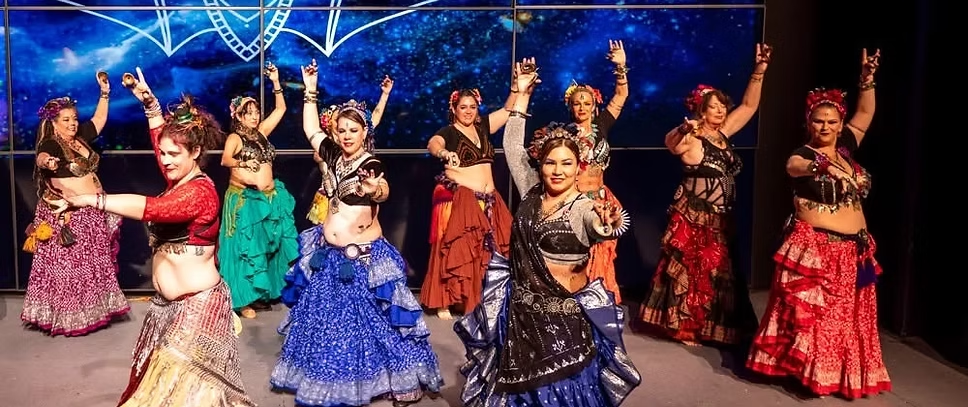
I’ve just spent two weeks making zil muflers and rubbed fabric panels for belly dancing belts. Why, you might ask. There’s only one reason. For love!
No. Don has not taken up belly dancing. And if he asks me for zill mufflers, I’ll tell him to scroung around the corners to see what he can find. No. This is for my goddaughter, Sarah.
Balcony Scene: Tom and Sarah
My godson Tom brought home Sarah his first year in college. I stood at the top of the studio steps and looked down. It was me, thirty years ago with blond hair. She looked both of us over and asked if this what Episcopal godmothers were like. No. This is just what happened. Tom is my heart. When she asked if she could be a godchild, I told her if she asked, she already was one. Funny, arty, up for adventures, huge heart, mind like a steel trap. I adore Sarah.
For some while, Sarah has been into belly dancing, and she runs a belly dancing convention called Migrations, in Austin, TX.
It appears to be a hoot. It appears to be a young person’s quilt convention without sewing machines.
What business do I have with belly dancing? There’s more connection than you think. Fabric. Check. Shiny, Check, Outrageous. Check. I may fit in better than anyone thinks. Besides, if Sarah asks me, I’m in.
Along with helping run this, she’s been given a booth in the convention mall. She asked me personally for some embroidery work for costumes and has offered to sell some rubbed panels
I’m embroidering several of them, just for her. We’ll see how they fit in.
So, as quilters, what do you think about this kind of thing? They’re a product of the rubbing plates I’ve just learned to make. I’m excited about them, but I’m not sure how they might fit in. It may be that we need long, skinny quilts.
Quiling has a wide skill base that includes many processes, many techniques and unheard of uses. Surface design is always one of them. And, for me, a siren song.
Last week I showed you my experiment recreating the elements of a piece I thought was particularly effective. At that point, it was speculative. You can read that at Again? Really. Yes. Really I’ve spent a week on it and here are my results.
I divided the parts into elements. Here are the elements I was working with.
The focal image
Hand dyed background
Oil paint stitck layer
Sheers layer’
Small elements
Background stipple.
What do these elements do?
The Focal Image is the answer to who. Ir creates the subject and focus of the piece.
The dyed background is the answer to where and when. It creates the light in the piece. It also defines the environment.
An oil paint rubbed layer is the texture of a piece. I don’t use it everywhere, but it gives a somewhat translucent surface without sharp edges. You can see the background, but it has shifted in color and appearance.
Sheers make another translucent shift across the surface. It transforms the background color and creates movement. Sheers have defined edges, but don’t have a visible thread edge.
Small elements can be used to establish a visual path. Flowers, rocks, leaves, bugs, birds and frogs can all point a direction through the piece.
Stippling changes the coloration of the surface. It creates dimension and defines light and dark.
I think I’ve failed on this piece. It’s not bad. It just isn’t as good. Why?
I’m reasonably sure of my background and my oil paint rubbing layer. The sheers can be dinked with.
I didn’t get to the small elements because I’m just not content with my drawing. These fish will add movement, but I don’t think they’ll help enough.
Oooops. Sometimes I don’t know until I get the piece embroidered. I drew other fish for this. This was the best of them, but it’s just not dramatic enough. I need a drama queen fish.
Here are the two drawings I rejected. I’ll save them for another piece another day.
I could push through. All the elements are there. But the experiment failed. I took similar elements, and they did not create the same energy.
I could blame it on the weaker drawing. That would be fair. But I suspect that the energy of the piece itself is different, and probably can’t be reproduced.
Will I throw it out? Heaven’s no! I can always use an extra fish. This one just doesn’t belong here.
So, as a rest, I’m back to octopuses. The fish piece is on the wall, aging like fine wine. It will find its time.
Fallow time seems to be an important part of the process as well. Repeating the same elements doesn’t always create the same energy. The parts just aren’t the sum of the whole.
I try really hard not to rate my pieces as I make them. I find that my opinions of things change over time, largely in reaction to people’s reactions. If I suspend my judgment of work, I find I learn more from it. Suspending judgment allows me to flesh out ideas and move on. Finish the quilt. Next quilt, please. The learning is the goal. The quilt is almost a byproduct.
But sometimes I do a piece that knocks my socks off and throws me across the room. It’s not an everyday thing. When that happens, I find myself asking some of the same questions that I ask when I do something I hate. What happened here? Why is this piece wonderful? Or awful? What?
Was it the color palette? Technique? Is it about my background? The image itself?
A fabulous piece makes you think, “Can I do this again? How did this happen?”
I love this piece so much. So I’m going to try not to reproduce it, but to focus on its successful elements.
Part of what I love here is the quiet palette. I normally go for eye-sore colors. This was restrained. Luckily, the last batch I dyed had a piece, not exactly in the same palette, but in the same tone.
The fish can be the same threads. And I think it needs to be.
I had trouble with the fish. I wanted a fresh image, not the same, but in the same colorations. So I started several fish, only to find them wrong. I love these. But in terms of direction and size, they’re just not right.
I went through my collection of drawings. My embroidery process uses a pattern drawn on Totally Stable that goes into the back of the piece as a pattern and a stabilizer. So each drawing is consumed by the embroidery itself.
Not to worry. For the last 3 years, I’ve saved a tracing of my drawings for later. It’s turned into a jumping-off point for other pieces, and I consider that collection a treasure. I found a fish that had to be at least 10 years old, which I don’t believe I ever used.
This will be reversed when I’m done. I’m half way through the embroidery.
Originally I used a tree rubbing plate both for the trees themselves and for the reflection in the pond.
And I want to explore the rubbed oil paint trees. This piece of fabric evokes a stream rather than a pond.
Now that I’ve analyzed my elements, we’ll see where it goes. It’s at that awkward spot where everything looks wrong. But that’s the exact moment to suspend judgment and push through.
It may take all those elements and work well. It may not. There’s a mystery here I don’t understand. But I think that part of it is that a piece is not the sum of its parts. Instead, perhaps it’s a whole being itself. Maybe it can’t be reworked with the same success.
Push on. Finish the quilt. Next quilt, please. The learning is the goal.
I’ve been working on this piece for a while. And then I’ve needed to let it sit.
Partially, I was waiting for weed stencils I could turn into rubbing plates. They came from Temu. and took forever. But I’m pleased with them. I want more, higher up on the right side.
Now we come to the tricky part. We have a blank space on the left hand side. You don’t have fish or frogs in surf. Maybe butterflies by the shore. I think rocks would be understated and wrong. What will I use to fill in?
Usually I know my options pretty well. I work a lot with grasslands and swamps, rivers, and ponds. Ocean shores, not so much. I’m not sure what is on the beach except for horseflies. Somehow, that’s not what I wanted.
Google didn’t help either. I looked up coastal insects and got lots of information about pest control. I was hoping for pretty pest control subjects. They did mention some pretty moths.
This is a moment I’m glad I’m a bibiloholic. I have in a series of books, Florida’s Fabulous insects. I have a terrible urge to use a lunar moth I already embroidered. IT worked pretty well. Moving moths could set the path for the eye through the quilt. When I looked it up, luna moths are down there.
So I drew out a series of luna moths. It’s more than this piece needs, but there is no such thing as a luna moth I won’t eventually use.
Design is a process. Solve one part of the puzzle, move to another part. Waiting is also part of the process. I find pieces grow into themselves rather than follow a design I had in mind.
I’ve spent a lot of time working with making rubbing plates. Here’s one of the reasons. There are ways to make waves out of sheers and lame, or stitchery, but I want that feeling of white foam and spray.
It’s pretty. But it lacks definition. I can approach this with thread and/or sheer applique. It’s also a test case for my cranes.
This is what I’m aiming for. I’d rather not make my mistakes here. I’m waiting on some beach grass stencils to finish off this top. But I’m still unclear how I want to treat my water.
The two pieces give me the opportunity to try different ideas and compair them. For Making Waves 1 I treated the white bits as different from the darker blues. I stitched it with 40 weight madiera metallic supertwist first. That was miserable. Sometimes Supertwist will work with a 90 topstitching needle and a lot of Sewer’s Aid. This wasn’t that time. I got about three stitches before breakage. That’s past my tolerance.
So I went to plan b
So instead. I stitched the white waves from the top with poly 40 weight. The stitching from the top marks the back Then I traced the stitching with #8 weight candlight, rainbow.
I like this a lot. I went back in after that and stitched the rest with matching poly 40#.
Making Waves 2 is my second possibility.I stitched the waves withpoly 40#. More subtle but I like it too.
I also tried two different approaches to my sheer overlays. For Making Waves 1
I used white and purple cheesecloth. I found it too clunky.
Making Waves 1 sheers with cheesecloth
I like this treatment better. Metallic lace and white organza just blends in better.
Making Waves 2 sheerswith fish d1
So to recap. I like the thick threaded Candelight on the waves, 40 weight polyester on the darker sea, and metallic lace and organza on the waves. What do you think? What would you choose?