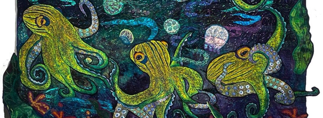
Stitch Vocabulary Book: Hard Edge Applique

Most people don’t think about free motion being an applique technique, but it gives you lovely curved edges with great textural lines. Here’s a sneak peek of the chapter on Hard Edge Applique.

Stitch Vocabulary Book: Bobbin Work

Here’s Chapter Three of the Stitch Vocabulary Book! This time we’re focused on bobbin work. For more information about bobbin work check out Topsy Turvy and Skimming the Surface both on bobbin work.

Thread Magic Stitch Vocabulary Book will be available for sale in early May!

Turning Over a New Leaf

We’ve talked about ways to make leaves more real. Leaves are wonderful shapes in themselves, but because they bend and fold and move, they add movement to your piece.

I’ve been working on a fish quilt that I wanted to frame roughly in kelp leaves, and it seemed like a good study on making leaves fold. Kelp is a water plant that bends completely to the movement of the water. But it has a definite back and front. We’re going to experiment with making the leaves fold for this quilt. Here we have just raw cut leaves.

I can see some purples in this as shadows, perhaps, but what I really want my thread color to do is to define the front and the back of the leaves. I intend to stitch the edges pretty heavily, so I’m going to do the leaves separately. I’ve cut leaves freehand from several scraps of green and glued them to felt with Steak a Seam 2. On the back, I have Stitch and Tear which is a crisp tear-away non-woven interfacing. So my embroidery sandwich is my hand dye, Steam a Seam 2, and Stitch and Tear.

I took a piece of the release paper from the Steam a Seam 2 leaf cuts and have folded it in different ways so you can see how that affects the leaf. The front side edges will have heavy crenellation on them. The back sides will be smooth where the folds are.

My thread zones are back and front sides. The front needs to be bright/dark /intense colors. The back needs to be muddy, greyed, soft colors.

It seems like the fabric should define the leaves completely, but I’ve found that’s never really so. What defines much of the leaf color is the thread. If the thread is purple it’s at least a purplish leaf. Sometimes that’s the way to go.

stitching the leaves

Here’s a video showing the crenelated stitched edges.

The leaves fold in the water. On the front side, their edges are crinkled and bright. The edges on the back sides are smooth and greyed out. once they’re applied to the quilt I can take sheers and lace and overlay them with water so they look wet.

Here are some of my separate leaves, made to fold in the water.

I’m not so sure about this layout. I think I need to leave it on the wall for a while and see if I have the placement right. I may have overdone. But since nothing is stitched down, nothing is written in stone. I’ll see how it looks in the morning.

To explore more ways to make leaves check out my previous blog post, Over and Under

In Praise of Older Machines

No one likes a new machine better than I do. That whole new machine excitement when you take it out of its box, set it up, and take a square of cotton to run it through its paces, see what marvelous things it does. It’s a magic moment.

And not an everyday one either. Most women keep a machine for around 14-15 years. I do too. At that point, if you sew a lot, you’ve probably worn it a bit. And there’s always the new and cool things the new machines do. But after 15 years with a machine, it’s almost like an extra arm. You know what it will do and how to do it best.

Small disclaimer: I am a Bernina girl. I have no affiliation other than the fact that they have the best stitch in the business. I appreciate other machines. But my workhorses are all Berninas. This is not to say you couldn’t do my techniques on other machines. I’ve demoed everything at one time or another. But I prefer my Berninas for their stitch, their feet, and their toughness.

Several years ago, Don bought me an old Bernina 730. It’s at least 60 years old. I didn’t bond with it over much because it wasn’t quite as fast as some of my machines, but it ran well. Its zigzag was a little ratty. I was in the process of new knees and that occupied most of my time and all of my energy. It got put on my machine rack. I didn’t exactly forget it, but I didn’t pull it out.

Lately, I’ve been working on some much larger work. This is a craziness of some sort, but I have a show coming up in September, and there’s nothing like one big show-stopper quilt to kick that off.

The new 770 Bernina is my love. It’s monstrously fast and excellent for large embroideries. But it hates monofilament thread. Even with the tension adjustments at a slow speed, it stitches about 3 stitches and something breaks. Mostly my temper.

So I’ve gone to using my 230 travel machine which handles monofilament fine. But it’s tiny. It’s a three quarter head machine with a 6 inch throat. I love it. It’s the best classroom machine I’ve ever used. It is, however, impossible to fit a 69″x 50″ inch quilt in that six” throat.

I pulled out the 730. Its slower stitch ate up miles of monofilament nylon without a hiccup. And I’m finally less afraid of the monster sized quilt.

Some personal thoughts:

Machines don’t break down in the closet. Your machine will break down in the middle of a crisis sew. This is just mathematics.

You need more than one machine if you sew seriously. See above.

When they offer you a trade-in on your machine, if you have the money and the space, hold on to your old machine. Becue there may well be things it does better than any new machine on the market.

Finally, if you do garage sales, rummage shops, or Ebay, keep your eyes open for legend machines that may need homes. They show up, much like God-given gifts. If not for yourself, for someone you know who may need them. Good machines deserve good homes.

A Visit to the Studio: Designing with An Extra Pair of Eyes

I

I always love it when people visit my studio. Studios are workplaces, the equivalent of an artist’s ivory tower. They also can be messy, wild, and full of possibilities. But they can feel lonely. I remember a conversation with an African Fiber artist. She told me she was writing from Darkest Africa. I don’t doubt that, but I told her I was within the shadow of the cornfield. It’s true.

So it’s wonderful to share studio time with others, to get their input, to help them with their work, to share the vision, and to get an extra pair of eyes.

My friend Sharon had been working on a contemporary quilt that had her nervous to start. Sharon’s a veteran seamstress with fine quilting skills, but she wasn’t used to the contemporary approach. She spent an afternoon where we tried a whole lot of things, just to see.

She wanted to do a piece with triangles on it. We placed the background on the wall. She had triangles cut of yellow, purple, and fuchsia cotton prints. We place them up randomly. It didn’t quite do it. But we took a black-and-white picture to see what was happening.

Black and white photos show us value. The light and dark of a piece define how it will be seen, what will stand out, and what will be the background. We noticed that the yellow really stood out. So we decided to use the yellow as subject and let the other colors support the yellow as the background for it.

It was still pretty random, so I suggested drawing a pathway across the quilt. She drew a path. She arranged the yellow triangles on the path and made a background of the fuchsia and purple triangles. Much better.

But the yellow was an odd calico, and it didn’t have a lot of punch. we pulled out some yellow sheers and lame`s. Since they were so shiny against the cottons, they illuminated the path. We cut triangles out of those and replaced the yellow calicos.

The black-and-white photo confirms that this is a strong design.

Sharon’s really pleased with this quilt. She’s ready to sew and sure of her design. I’m sure her niece will be thrilled when she gets it. I was delighted we had worked through some design decisions in a way that will help Sharon as she works on her next masterpiece. Studio time is holy.

I do have people schedule studio time. I even have a guest room at the studio where they can stay if they wish. And I do video conferences as well. We do whatever my student wants. I either teach them what they want to know, supply moral and technical support or help them work through design decisions.

Is it like class? No. It’s much more personalized. It’s a way of connecting artist to artist, with a second pair of eyes, to explore where your work might go next.

As for myself, it makes me think about things I never really work with ordinarily. That’s always a good thing. And I love the company.

Do you want to come to the studio? Contact me and we’ll set it up.

Tip ME

I’m a bit shy about this, but all art runs not only on desire or passion solely. There are bills to pay and we hope all of us as artists to sell enough work to pay them.

But those of us who have taught, who have shown, who have written to share their art know that much of what we do is never paid for, except in the sense that we pay back the people who came before us. It’s how we make a community for all the artists we know.

So if you would like to support me, buy me a cup of coffee, or let me know I’ve helped or inspired you in some way, here’s a tip jar. I know you’ve supported me all along my journey as an artist. If you’d like to express that in a monetary way, I’d be much obliged. Thanks!

Tip me

Flamingo Legs and Other Troubles: Designing for Smaller Images

Free motion stitching is versatile. One of the graces of working free motion is the effects you can get with the stitching, just out of the angle your fabric goes through the machine. It’s about filling in space.

I’ve been asked by someone to do a flamingo quilt. I’d been hesitant in general to quilt flamingos because they’re a signature piece for Ann Fahl who won at Paducah with an astonishing work called Flamingo Garden. I haven’t wanted to step on her turf. I hope she won’t see my working on a flamingo in that way

But as soon as I started to look at flamingos, I was hooked. The colors are eye-popping, after all those properly grey birds and they are outright silly. I’m in love.

So I drew up three flamingos bathing. These are much smaller birds. They’re around 18 inches as opposed to 40″. Their impact is different and the coloration on them has to be different. It makes sense. If you’re filling in less space you have to cut out some of what you’ve used to fill in a larger space.

There are several ways to do that. One is to use fewer colors. When I choose colors, I choose the darkest of the base color, then a shader color, a range of the base color dark to light, a shocker, and then the lightest of the base color. That range can be massive. It’s not at all uncommon for me to use 60 colors in an image. But for these little birds, it has to be less. I ended up using about 20 colors

The other way to expand the space is to use a smaller zigzag.

Finally, I used a straight stitch instead of a zigzag stitch for the detail overlayer.

Every piece is different: in size, in coloration, in stitchery. But I’m pleased with these little birds.

Wake It Up! Sparking Color With Overstitching

I love creating color with thread. The threads available make an endless choice of colors. You’re eye blends the bits f thread that peek out from their layers. It makes colors that are rich, dense, and complicated. What’s not to love?

But sometimes it gets too monochromatic. I was working on this heron and I wanted some fish companions for him.

When I picked out my threads for these, I wanted them red to stand out from all that grey in the heron. Red is funny. Like every color, it can lean either to the sun or the shade. A balanced red would use threads of both tempuratures. I used both kinds, a little purple and teal for shaders. And I threw in a green just to spark it.

By the time I got to the green, the whole mass was bland. Pretty. Stripy. Bland. I put in the green and it just woke up. Then more reds and finally oranges.

The green stitching on top is garnet stitch, in small circles. It changed everything!

Yellow overstitching creates a swirl on the fish face that helps round the face. Overstitching adds a color layer, but it also breaks through that bland smooth color.

It helps, of course that the yellow complements the purple, and the green complements the reds. But the textural elements also wake up the fish and feed our eyes.

Does Anybody Know What Time It Is?-Establishing time of Day with your Background

I’ve been working for a week on a flamingo quilt. It’s a commission of sorts, so I’m working with the owner’s druthers. Blissfully, we have similar druthers and I think she’s quite pleased.

Part of this week’s fun has been choosing the background The flamingo is all embroidered, so the next step is building her world. I was looking at colors when I pulled out fabric opportunities, but I discovered quickly that what really happened is that the background changed the time of day.


The background changes the time of day and that in itself is a powerful statement. One way or another she’s walking in surf but is it night? Is it in moonlight? Twilight? Afternoon? Early cool morning?

Those are more than logical questions. They make a statement about the quilt itself and what it conveys. They tell me about this bird, who she is, where she is, and what her world is like.

All done by a simple choice of cloth. It never ceases to amaze me. Mostly the fabric choice is about letting the subject shine, but that choice carries meaning as well as color. Hand dye is a miracle that happens all the time but only once for each piece. The miracle we choose opens all kinds of choices and shuts other possibilities out. I’m thinking this will be the “right” background

Final Choice!

I turned around the darker one so that her face is in the light. We have a winner!

Still deciding about the moons. Do I want arced moons or just one? Decisions…..decisions.

Want more information about backgrounds and hand dye? Check out Where will it land? Spotlight on Backgrounds