The Differences that Just Are

I had someone I knew well recently ask me if I knew I was different. Well. Yes. Actually the hardest thing for me has been to connect with other ordinary people. My life has not followed ordinary patterns or currents. Sorry about that. I get most places other people go, but I’m not on the same schedule. I’m not particularly ordinary. It’s fairly embarassing.

I know, even past her irritation with me that that would only matter if there were any ordinary people.

There are people who say they aren’t artists. I don’t buy that. We are not artists by what we do. We are by our genome. We are artists because we are human and that’s part of our humanity. We may not choose to make art or need to make art, but our humanity makes us artists. It’s common to us but it’s not ordinary.

There are always artists who are better than who we are. More ability. More output. More glory. Sorry about that. They’re not ordinary either.

Perhaps the only thing we have to offer as artists is our viewpoint. Skill is something we learn over time. We develop all kinds of abilities, and they change our lives. They are a wheel that runs smooth or rough against the road of time. We gather skills, we drop what disinterests us, lose them as we age, change them as we grow.

Our vision is who we are. What we see, the images we must work with, those sometimes change, but they are personal. They are all we really have to offer. Talk about different! None of us are much like other people.

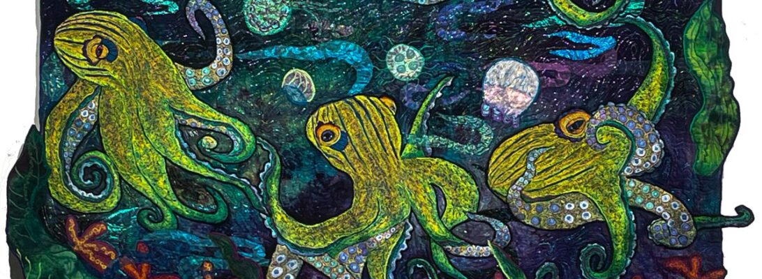
I tend to see people as animals. It’s not a comment on their humanity. It’s just my vision. All those bugs and frogs and birds, they’re people I know. That especially includes myself.

I am not like other people. I don’t think anyone really is. Our uniqueness is a sign and a symbol of that. I can’t help but wonder if ordinary is a part of exhaustion. Of giving up. Of giving in. Of course it could always simply be that I’m not trying hard enough to blend. But if you have this confusion where you see yourself as a large frog, well, there you are.

Thinking Outside the Box: That’s Not What You’re Supposed To Use That For

I remember being told I should color within the lines. It’s probably just as well I never was able to do that. I’m certainly not about to start now.

I’ve been totally hooked on paintstick rubbing. Like everything else, it’s a tool to be used with other tools. I’ve been exploring more and more how to incorporate different plates with each other in design. Here’s the latest batch.

I love them. And I’ve recently found some iridescent paint sticks in colors that didn’t come in the kits.

There’s only one limit I don’t like. The plates tend to be small. You can repeat all you like. But they don’t lend themselves to larger pieces. Not to worry. I decided there needed to be a way. I went looking for more kinds of rubbing plates. The choices are limited.

I tried drawing with glue on placemats. I tried carving foam. I got desperate and bought some fondant plates. All too small or not quite enough. Or a huge mess. Not satisfactory.

Not everything that works marvelously was made for that purpose. Some of the best tools of the quilt world have been borrowed from some odd places. My favorite thread bags were originally worm bags for fishing. Rotary cutters started as carpet cutters, I’m told. Surgical seam rippers really are a surgical tool some brilliant nurse brought in to their quilting studio.

So in that same spirit, I bought some ceiling tiles. They’re two feet by two feet. And beautiful! Stiff textured plastic. Exactly like a rubbing plate, only bigger.

Here’s what they look like rubbed. I’m in love!

So I’m not supposed to use ceiling tiles that way? Isn’t a good thing I didn’t pay any attention to those rules? I think so.

Batch Quilting: How Many Quilts Do You Have Unfinished? How Many Quilts Can You Finish At Once?

I’ve never understood people who worry about unfinished work. I treasure my unfinished quilts because they are springboards to more new quilts, just waiting for their time.

I learned a while back that it was easier to set the machines for one process and work a number of pieces at a time. It seems a bit scattered, but it works for me. I spent yesterday working on 8 quilts at once.

It makes sense to do all your dyeing at one time. It also works to do oil rubbed fabric in batches. I could do one at a time, but the mess is prodigious for both of those. Here’s the rubbed pieces of fabric I used for my quilt batch today.

Once I started straight stitching with metallic, some quilts needed more. Some need couching, some need extra flowers, some needed either applique or embroidered applique. So I line them up by the techniques involved. Then I set my machine for the next process and do them all at once.

It creates a lot of work in a hurry. Which is good right now because I’ve sold a number of small quilts over the sale, and am going to add these to the sale as soon as they’re done.

So, no guilt! Unfinished quilts are invitations to new work. And they finish quicker if you do each process at a time.

I find myself taking things in batches. Each quilt gets exactly what it needs. But I can work smoother and quicker by taking them in batches and working one process at a time, not just one quilt.

Look for these quilts up for sale early next week. They’ll be on Etsy at www.etsy.com/shop/EllenAnneEddy

Designing Ways: East Meets West

972 Shelter from the Storm

This is another modified blog from almost ten years ago. It’s still an interesting story. And an interesting way to think about how we design our art.

It’ss almost impossible to talk about our art without talking about the art that comes before us. Before we talk about design, it’s worth saying that there are many different design aesthetics. It’s not that a design is good or bad necessarily. It’s designed to be part of the statement. The notions that fuel our art choices are a statement loud and clear past subject matter and past our technical handling of fabric and thread.

As quilters, a lot of us have backed into art by accident. We started with squares and one day found ourselves with an odd quilt that somehow was an art quilt. Maybe it had too much orange in it or you found yourself like me, embroidering frogs and bugs into the borders. There’s a tender soft spot in most quilter’s artistic persona. The part that said that you should have gone to art school or studied water color. So our first designs spring out of a personal view. Later, as we become more facile, we realize that the choices in design are a huge statement all their own.

My first artistic love was the impressionists. I grew up near Chicago, and there was a pilgrimage every year to the Art Institute. I strolled through the halls looking for paintings like old friends. Since they were my first real introduction to art, they felt bland to me. Safe. Something soft and soothing out of my childhood.You know it’s become mainstream when you see it on a birthday cake. This astonishing cake is by Megpi, a pastry chef in Silver Lake. California. You can see her work if you follow the link to Flickr. 

impressionist cake by megpi

impressionist cake, a photo by megpi on Flickr Since you can buy Van Gogh’s work on umbrellas and coffee cups, it’s easy to miss the point that he was a raving revolutionary in his time. His work nauseated the current critics, got him hospitalized, was refused for all the important salon shows, and the subject of ridicule in the press. Time and familiarity have made him a lionized artist, but that was not who he was when he began.

I was immediately in love when I discovered Japanese prints. It was a while before I realized why. The Impressionists took much of their new artistic vision from the prints out of Japan. The first prints that came out of Japan hugely influenced them as beginning artists.

In contrast, this is a painting  called Nocturne from around 1825 by Turner. Turner would have represented the design aesthetics from the early 19th century, that Van Gogh and the other impressionists and Post Expressionists blew out of the water.

Early 19th Century Western art was about permanence. It honored stability. It was a world of people in their proper places, forever and ever. It used Greek and Roman scenes  and portraits of nobility as an way of saying we had an eternal understanding of a changeless world.


Japanese art was about the moment. It moved. It created a path for the eye to follow. It went off the page. The impressionists saw it, fell in love with the concept and incorporated it into the designing of their art. The movement is called Japanisme. It was in my humble opinion, the beginning of modern art. And changed us all.


Myself, I cherish movement. I plot my quilts to travel from one side to another, taking the eye on a journey across the surface. The visual path and vertical path quilts I’ve been exploring are all about the traveling eye.

The decisions behind design are the most telling. Without a word they say so much about what we create, what we find important, and what we value. The way we structure our art is at least half the story we have to tell.

971 Waterlily Pond

Laughter for Drama Queens

For fun I was looking at some old posts of mine. I found this fun and wanted to share it with you.

I am a redirected Drama Queen, Daughter of a Drama Queen Delux. My mother was not a happy girl until she had a drama 10 feet high and too wide to get through the door. It was all about telling stories.

Now Margaret Eddy was the queen of all stories. And a serious fan of silly. She told amazing whoppers, one-liners, true tales spun into gold from straw, hopeless lies and astonishing steaming piles. She loved her drama. She had a somewhat loose relationship to truth. She was a devastating school teacher, because much of that could indeed come out in a teacher conference meeting or a family reunion. But she had a special gift for looking within and without. First she’s build you a verbal image of herself as she felt about the story. But then she’d draw you into an outer view, where you could see her spinning in what she knew was a silly situation, build for howling laughter.

It happens to me in my quilts. I’m quilting along and I realize that this silly thing I’ve drafted is someone I know. Or worse, me. There with all my rather small fears and desires. I’m not overly deep. I’m just noisy. At that point, it seems just to the point to let it be silly. I am. It is. And the world is better for it.

This quilt, The Orchid Olympics, wasn’t meant to be funny. It just happened. I’d found a great picture of a frog in an odd pose and worked with it. One afternoon in a class demo, I was placing it into the piece and trying to put a sun over his head. It wouldn’t go. It just wouldn’t go. Not over. Not to the side. 

I looked again at the frog and thought, “If you get into that pose, it has to be for something like the Olympics. No one would willingly bend like that otherwise.” The sun fell into her hand like an award and there we were.

Mirror, mirror on the wall, I am my mother after all. But I try never to tell a story on myself until I’ve found the funny part. Perhaps it helps to be short, round and have a pug nose. My gray hair also seems to give me an amnesty for silliness. And why not? 

Eye Popping Color: Charting Color in Fantasy Mushrooms

I’ve written a lot about color because I think a lot about color. I It fascinates me, from dye, to fabric to thread. I’ve been working on a batch of mushrooms for some new quilts and I decided to look at the colors through the color wheel just to codify what I was choosing.’

I’m not going to talk about color theory here, precisely. Instead I’m going to talk about relationships in color. Color theory can be deeply and obscurely discussed in millions of ways. I’ve seen it discussed as building blocks, tonal poems, wave lengths and light waves. I’m not sure how much of that is useful. I thought it might be helpful to simplify instead. I’m not dissing color theory. But I am trying to think about it differently.

I’m also not going to use color names. I want you to look at the relationships of the colors instead. But here’s the distinction I find most helpful. Color harmony has to do with how close colors are on the wheel. Contrast has to do with how far away they are. Harmony is of course beautiful. But contrast is what draws our eyes, It is what makes colors pop.

Contrasts come in several style. The colors themselves are their positions on the wheel. Darkened and lightened colors make the tones and tints. Then there is the clear colors. So for fun, sit back, get drunk on the colors and ignore the names. But look where the contrasts and the harmonies are in these color choices.

Notice the range of purples together that create a smooth section of colors and the yellow and greens that contrast. Notice the differences between the dark blues and purples and the lighter yellow and greens. The further distance colors are from each other, the stronger the contrast. The contrast creates the pop.

It’s not as simple as a recipe. It’s not what I was doing. But I did pick full swaths of colors next to each other with a few colors opposite from them. I also actively chose light/dark ranges for harmony and for contrast. It’s not about what we name colors. It’s about their relationship together. The very light green makes the sparkle on this ‘sroom. It looks white. But the green heightens the contrast.

Shading looks different than colors put side by side, but they still meld into each other. The eye blends thread colors that are sitting side by side.

Where are they going? They’re not in place yet, and I’m hoping for smaller frogs to go with, but bright kick ass mushrooms are exactly what I had in mind. I think I’m going to make it rain.

In process forest floor with mushrooms

I’m going to leave you with a small gift here. There are two color wheels here that I made for this blog, one empty and one fully colored. I invite you to use them to chart your own color on a project as you work. Down load them, print them up and use them to see how the colors you use chart up and relate to each other. And let me know what you find. It can be eye opening.

You are welcome to download these two pictures to chart your own colors!

The Light of the World: Creating a Fabric Universe

The blue fabric creates the light that shades these flowers with blue, and pale green as well as white

You would think that the light in a quilt begins with the color choices of either thread or fabric. It does, and it doesn’t.

The red/fuchsia/ soft orange shades this white mantis with bits of pink and yellow as well as white.

It comes back to hand dyed fabric. I dye fabric because it creates a world of it’s own. The color of the fabric creates the light of that world.

I’ve been working with an idea of frogs on a false bird of paradise vine. I wanted a daylight background that would bespeak greenery without being strictly green. So I started looking for a piece that create that world.

I did not dye fabric for this specifically. This is what I had in house.

So which will I choose? I pulled out the purple first thinking it would give more contrast. But it was absolutely glum. The blue looked like a good choice but it was in itself too watery and not long enough. I didn’t mean to pull up the piece with the lavenders and greens, but I love what it does with the purple stitching in the frogs.

And look what it does with the red/yellow fabric for the vines. The fabric makes the light of the world I’m building.

Had I dyed fabric for it, I might not have been as pleased. When I do, I dye at least three-five pieces in a range to get one I like. Hopefully.

But all those purples, greens and yellows can’t be too wrong.

I’ll show you more of this piece as it goes along.

Large Quilt or Small Quilt: Does Size Matter?

I’ve spent the last year rebuilding my body of work. When I married Don, I had perhaps maybe 40-50 quilts in house depending on how old the quilts are you are showing. For the first three years my occupation here was mostly in figuring out how to live around another human being. Then I had knees redone. Three actually. You can need to have to have a knee done twice. Don gave me his house as a studio a year and a half ago. All of a sudden I’m working again on a daily basis. It’s good for me. It’s good for my heart and soul.

So I’ve been experimenting for my own pleasure, but I’ve also been working towards having enough work to show. I don’t intend to teach on the road again, but I do love showing my work. And since it doesn’t necessarily fit into the standard quilt show, I’ve always sought out sole artist shows.

That means having a full body of work. Your standard one person quilt show in a small gallery is probably 12-20 quilts depending on the size of the gallery and the size of the quilts.

Five years of not producing work doesn’t sound like the quilts would disappear. But they did. Some sold. Some got given. We went from around 50 to 15.

The size of an art quilt is about the space it fills. If it’s in a large gallery or show, it needs to be the size of God’s underwear. If it’s for a small space, it needs to fill the space appropriately to make itself known. It should at either size, change the energy of the space by it’s presence.

So this last year and a half has been a building up of work. I love doing the little pieces. They’re light and fun and full of experimentation. I’ve always loved them.

I’ve always loved doing the visual paths. They’re elongated universes designed to take your eye through a trip They make a huge statement without being huge and they fill a space in a unique way.

But big quilts. Big quilts take for ever. Big quilts are always a huge risk. They are hard , hard work. And they’re made to be show stoppers. As in, if you want a show, be prepared to make a mountain of these. Or your sort of stopped.

They usually take 9 months to a year, although I don’t work on them constantly. If they are disappointing when you finish, it’s a huge loss of time and energy.

I’ve never found that I could take a small design and blow it up large. The space fills in differently if you do that, and it’s hard to make something that’s interesting both as close up and at a distance.

Obviously it’s a matter of balance. Most people have a size in their head that is comfortable, and that’s as big or small as they go. But it’s worth working past your comfort.

Does size matter? Yes and no. Size makes impact. It makes a statement. It makes legend work.

But small work, intricate work makes a small space resonate with it’s energy. It’s worth doing it all, as best as you can. The stretch either way is good for you.

Thread Colors to Dye For: How To Dye Threads for Shading

I’m obsessed with thread shading. I want images to be as 3-d as possible. To do that I shade with as many colors as I can. With regular #40 embroidery thread, I can use almost an infinite number of colors to shade an image. Particularly for a larger image. It’s a pretty large paint box. And you can use them all.

With heavy weight bobbin threads, there’s just not that much space in an image to shade. So this is my answer. Instead of adding more and more colors, I dye the thread so that it’s got a range of color within each thread.

Most commercially dyed thread comes in one of two styles. Either they mix a dark color with a number of lighter shades ending in white. Or they do the rainbow either in pastels or brights. The rainbow color ones work for stippling. They don’t shade well at all. The ones with dark to white leave a white area I really don’t like.

Most images can be zoned in dark, medium and light areas. They also can be zoned into different colors, like the spots and the frog’s body.

Dyeing threads to shade images can be set up the same way. You can dye a shader, a shocker and a smoother. The shader thread is the color of your image darker than you want the whole image to be. Add in a dark shading color like dark brown, purple, green or blue, or it’s complement, plus 4-6 dark shades of the whole color. The shocker is a medium range of 5-6 colors with a shocking color mixed into it. Usually a bright complementer color works best as a shocker. The smoother is a color that is a bright highlighter shade that fills in the image and finishes in the shaded image.

The range of colors gives you at least a 15-18 color range in a small bobbin work image. Other colors can be added. There are no rules, but here are some color ranges that work well.

Shader: Dark orange, yellows and reds, and browns

Shocker: Yellows and two purples

Smoother: Yellows and oranges

Shader: Dark purples, blues and greys

Shocker: Medium greys and teals

Smoother: Medium to light purples

Shader: Teals, and oranges

Shocker: Yellows and teals

Smoother: Yellows, and oranges

You get the idea. Dye the thread to do your shading for you. As you fill in the stitching with rhythmic motions, the shading progresses across the image. All you have to do for thread like that is dye for it.