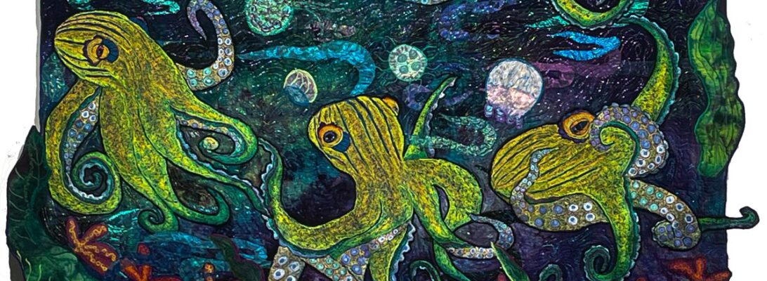
More Pop Octs: Dancing with Design

This has been a rough week of a lot of medical appointments. Nothing bad. Just exhausting and demoralizing. So last night I had a serious dose of color therapy. I watched Yellow Submarine.

This is the best color therapy movie I know. I’d add Fantasia and Avatar to that list as well. Who cares about plot? Endless mixes of impossible color combinations. I’m still half drunk.

If you asked for a description of the color theme, I would say it’s full-color-wheel bright.

But it’s also an outrageous usage of way too many tertiary colors running amok. I’m in love.

I’ve stitched the rocket octopuses. I started with a background that reminded me of confetti yarn, bright bits of color on a soft background. So my octs had to be bright where the background was softer. I’m thinking of calling them the Octettes.

But now we’re at the fun point. We get to create the design.

This is the first pin-up. I do several pin-ups with each piece. The first pin-up is just the background and the creatures. With that pin-up, I’ll know my colors, my path and where the creatures interact with each other and the viewer.

The second pin-up is after I add the elemental bits. Usually these are sheer unless they’re rocks. Water, rock, air currents, sunlight. It’s also where I add small elements that help establish my visual path. I’m thinking gold and orange fish.

The third pin-up is my final design. After I do the third pin-up, I’m ready to stitch. And my options are in stone.

So now I can try it all out. Different backgrounds, different octs.

If it’s just one or two possibilities, I pin it up and shoot photos. Here I had a bunch of choices so I photoed the elements and put them into photoshop. It’s a cheap thrill, but it’s much less aerobic.

Here are the ones I like best. I really like the ones swimming in opposite directions. The ones weaving tentacles work best on the larger pieces of fabric. I’m still not sure.

I’ve done this before in a blog called Pin Up Girls: Family Planning for Octopuses. There I was trying out a number of different quilts. This is just one. But it is a good way of looking at options, without having to pin everything up physically.

What do you think?

Popping Up: The Pop Art Element

I’m not a very abstract person. I’m not good at reducing forms or working without a visual reference. Of course, I’m not always wedded to reality either. I believe that when we stray from a photographic reality, who we are, what we mean, and what we see have a way of coming out to say, “Hi!” And a lot of other chatter as well.

For a long time, reality was the task of art. Up through the Renaissance to modern art, we’ve lauded the ability to make something that looks real. I find that wearing as an artist. If you want complete realism, you probably want photography. You’ll see your image just as it is. Once we had photography, realism stopped being a goal and became something accomplished.

Photography works for the surface. It fails me for movement, for mood, for expansion off the canvas, and for the feeling it gives me. I have nothing against photography. But it usually leaves me a little cold.

So once we left realism as the only goal, there was room for all kinds of experimentation.

One of the experiments was Pop Art. There were many versions of this. One was to repeat an image in rows or patterns in bright colors. This is Andy Warhol.

Andy Warhol, Converse Tennis Shoes

I’m not interested in tennis shoes, but I do want to see what happens if I put repetitious octopuses in bright colors together. This is the first octopus. The plan is to put four together. I’m not sure if I’ll use rows or weave their tentacles together.

The colors on the octopuses echo the hand-dyed fabric I’m using. They have a light source that shifts the colors through the tentacles.

Here are three more in different states of completion. When we’re done, we’ll see what pops up.

Going Straight: Stretching into Different Stipple Patterns

I’ve been working on the octopuses for around five months. There are seven in all, five finished. I’m pleased to say they make a good start for a show.

But I don’t want quilts that look like the same pieces, only in different colors.

What defines a work? Certainly subject matter. Certainly color. But textures also make pieces stand from with each other.

I’ve leaned heavily into oranges and blues on this collection, but I think there’s a good range of colors. The background is always the color of your sky, the mood of the piece, and its definition

The octopus’s garnet stitch texture connects the grouping.

Something more subtle separates them.

The stipple treatment establishes the movement of the water, but it also visually separates the pieces from each other.

Confession. Left to my own, I have three stipples I use. I really felt I needed to stretch a bit here, particularly because I want the quilts in this series to stand up as separate works.

Version 1.0.0

Leah Day’s book, 365 Free Motion Quilting Designs has become a go-to reference for me. I don’t feel a need to copy her designs, but it’s full of a lot of stimulating ideas. It’s one of the few books I store right by my machine. It’s a worthy resource. I turned to it for some different stipple ideas.

I almost never do straight lines in my work. I’m not very good at them. But I love the bubbles and stripes here. It’s almost like wallpaper for the quilt.

Here are details of the other quilts, showing the different stipples.

Leah’s book is a lovely springboard into other possibilities. It’s available on Amazon

So I went straight on one of them and survived. Maybe I can do straight lines.