
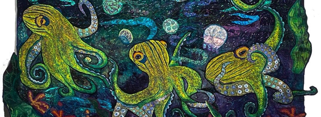


One of the hardest things in embroidery work is to get over the match instinct. After years of perfectly matching thread to my project, I’ve had to learn to pick out the highest contrast threads to make an image that really shows up.
In embroidery, contrast is everything. If it all mushes together color-wise, then you have a very mushy image indeed. Smooth color exchanges that are analogous and sit next to each other on the color wheel are pretty. But they don’t have much punch. So what you want is color that builds not on similarities but on differences. There are several kinds of contrast: color, tone, clarity, and temperature.
Today we’re talking about color, which is simply the hue and temperature. Is it red, blue, or yellow? Or an odd shade of green? It’s not as simple as it looks. There are a million reds, blues, and yellows. They are not the same.

Thermal shock is about the temperature of a color. Every color, no matter whether it is a cool or warm color, leans either towards having a cool or warm cast. It doesn’t matter if it’s a cool color or a warm color. There are cool yellows, there are hot blues. If all the colors are either cool or warm they’ll flow into each other like analogous colors. But if they’re not? You get thermal shock. It’s like standing in a cold-water sprinkler on a steaming, hot day. The effect is kind of visually electric.

Blue and Yellow Don’t Make Green is an excellent book explaining thermal variations and how that creates differing colors. It’s set for watercolor, but it applies to all color theory. It’s a worthy book.
So along with the different hues, there are shade and sun versions of primaries. I’ve been playing with them on this phoenix.

I wanted this bird to jump off the surface. I’d decided to outline with in a yellow that leans into the sun to give it some definition. But I wanted it showy. So the colors I picked, cool orange, cool and warm yellows, cool and warm blues left it shimmery and gave it impact.
So here’s another contrast. All that bright sky and bird against misty grey clouds.

For a final contrast, I put small trees up and down the river, to have that clear cool green against all the soft clouds and the fiery bird.

Always look for contrasts. Blending is beautiful, but to give a piece impact with something as small as a line of stitchery, you need heavy contrast, either in hue, value, or temperature. It creates a pathway through your quilt. But it also makes your stitching shine.