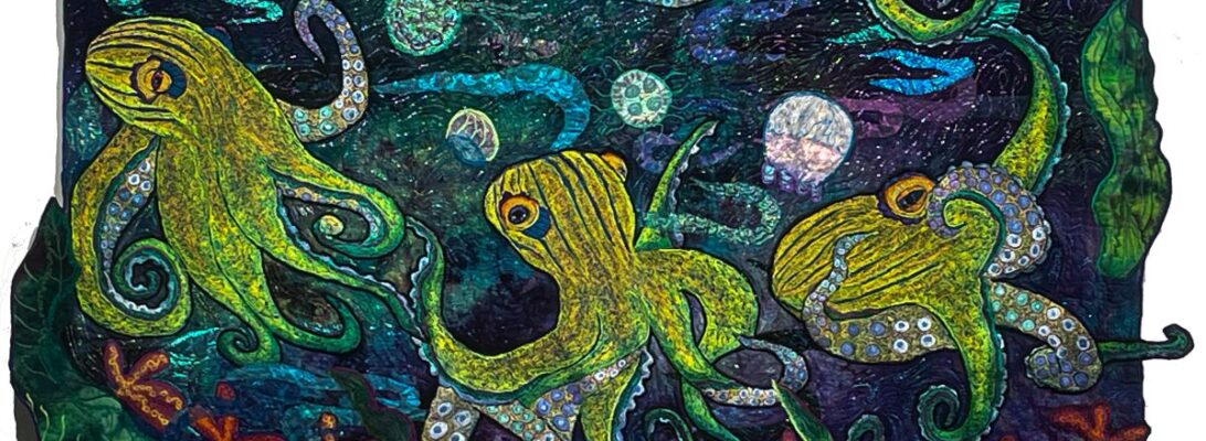
Color by Contrast and Cast: Adjusting Your Tone

Whenever I work in beiges, I get in trouble. Perhaps I’m not in well enough with St. Kim the almost-virgin martyr, who is the patron saint of beige. It’s off my map. Perhaps I should light a candle.

When we think of color, we think of hues. Red, blue, green, yellow.

But color is so much more complicated than that. Which is the frustration of kindergarten crayons in a box. Too simple to be of much use. Hue alone is only a starting point.

Color is defined by many factors. What matters sometimes is not the hue, the raw color itself, but the contrast between the other factors. Extreme contrast sparks our interest and makes the definitions clear.

There’s a quilters’ tradition for this. Log cabins and shade and shadow quilts have always been built on a dark side and a light side. You separate your fabric, not by color, but by value, how dark and how light the fabric is. This quilt is divided dark and light, but the cast of the colors is a soft beige. It’s defined by what they left out as much as what they included.

This trick works for a million and one quilt designs. But all color is color. It works in thread work as well.

I’ve been working on the next octopus, which is striped in black and white. I could have done that. But it’s dull past hope. Shading black and white is a great exercise, but I didn’t want it for this piece.

Here’s where I got myself into trouble. Those somewhat pink tentacles are a bit disconnected from the sand-and-gravel colors of the octopus’s outside. Pretty but wrong.

The background surprised me too. I had been looking at some murky colors. But when I put up this piece, it was it. I didn’t even pin up something else. But it was loud.

I quieted it with some soft elemental seashells in neutrals. Pretty, but not enough.

I dulled down the yellow fish. I stitched several colors of purple over them to give them some depth and to dull them. Again, not enough.

I made some fish to match the under tentacles.

Of course, I missed the idea of changing the octopus. I gilded the octopus. This odd green-gold thread has become a favorite shader lately. It shifts the tone of the piece. Big change.

Anytime you go off your map with a piece, you’re in for an adventure.

I have high hopes for this piece, but it’s taken a bit of maneuvering to get there. We’ll see how the pieces go together.

Hummingbird Commission 4: The Background and the Applique

You would think that the background doesn’t have that much impact on a quilt. Something pretty to showcase your basic image, right?

Not my experience. The background sets several things in place. It sets the time of an image. And each background tells a different story. The images tell you the who and what. The background tells you how, why and where.

Here are the backgrounds we chose preliminarily for this piece.

They’re all good choices. They tell a different story. Is it daytime or night? Is the flower alone, or is it in a garden? Size tells you different things as well. Smaller pieces are more intimate and look more intricate.

Since this is a commission, it’s the owner’s choice. She wanted the soft background with lots of flowers.

I love these oil paint stick rubbings! I usually overstitch them to accentuate the texture. I did that here as well

Lately , with paint stick backgrounds, I’ve been stitching the whole background, rather than applying my image and stitching the background around it. It makes a smoother piece, and it blends in better.

These are stitched from the top with polyester Neon Madeira. Since I’m following the rubbing, I need to have it on top where I can see it.

Buto it’s still worth looking at it from the back. You can see the unstitched part that will be covered by the flower.

Here’s where the flower fits in. I edged the flower with an angled zigzag stitch, echoing the colors I used in the petals.

For the hummingbird, I wanted him to pop. So he got outlined in black. It sounds unoriginal, but black always has more impact and leads to a more defined edge.

We’re ready to back and bind here. Thanks for taking this journey through this quilt with me!

Hummingbird Commission 3: The Flower

Every hummingbird deserves a fine buffet lunch, so this one has a flower of her own. The flower is made from different pink lace sheers, cut into petal shapes and backed with Steam-A-Seam 2.

I love using sheers as flower petals. Petals are, by their nature, translucent. But the sheers need extra support. I use a piece of felt in a color that I won’t mind seeing afterwards.Steam-a-Seam 2 is an excellent glue, but it also stiffens the piece. I also have a piece of Stitch and Tear behind it all.

Steam-a-Seam 2 is a fusible glue sheet backed between 2 pieces of paper. You peel off one side, place your fabric on the glue, and it will stick of its own accord. Then you cut out your shapes. It leaves you with pieces much like color forms. You peel off the other piece of paper and you can place your pieces as you like.

When you’re happy with your placement, you can iron down your pieces. You’ll want a Teflon pressing cloth, because the glue will seep through your piece. Iron thoroughly on a medium-high Steam setting. You can clean the pressing cloth with a ScotchBrite Blue Scrubby for non stick surfaces.

All of that leaves you ready to stitch. I’m working with a zigzag stitch. Each petal needs to be outlined and detailed, but it really doesn’t matter in what order. So I can change the areas by petal so that I’m using different threads from my thread range across the flower.

Why go to the trouble of making the flower into an applique? Because after all that stitching, it’s going to pucker up and want a kiss. Cut off all those stabilizers, and you’ll have a flat and lovely flower for your quilt.

Want to see this completed? You’ll find the whole project on my Patreon Page.

It’s free to join!

A Hummingbird in the Flowers: A Commission

Part 1: The Drawing

I have a commission that I want to share with you.

I don’t do these often because commissions are hard. Commissions demand a lot of communication that sometimes doesn’t work as well as it should. It’s hard to talk about something that is strictly visual.

But this is for a friend. And it’s a small piece. We’ve talked through what she wants. It’s a 7×10-inch ruby-throated hummingbird with a flower. I’m pretty confident it will be what this lady desires.

Because it’s a small piece, I’ve decided to do a series of articles and videos about making it. It covers different skills and processes. For you, it’s a look behind the scene to see how quilts are made. For my owner, she has full documentation. You can all watch step by step how this quilt is created.

She wanted a red-throated hummingbird.

It all starts with a drawing. I draw out sometimes just my subject. Because this is a commission I drew out a number of birds so my owner could choose. These drawings are on Totally Stable, which is an iron on, removable stabilizer that has a good drawing surface. I use it for all my patterns.

This is the bird she chose. I need that bird flying left to right. But because the pattern goes into the back side, the face side will be left to right.

I also need to zone my pattern. She has a green body, grayish wings, and a red throat. Zoning reminds me what threads to use in the top of my machine. Each zone will have several colors within that range that go on the bobbin side. Since we’re upside down, that’s where they’ll show.

What’s next? Stitching in. And figuring out how to make the video program work better. Next week

Want to see this completed? You’ll find the whole project on my Patreon Page.

Thermal Shock: Eye Opening Color

One of the hardest things in embroidery work is to get over the match instinct. After years of perfectly matching thread to my project, I’ve had to learn to pick out the highest contrast threads to make an image that really shows up.

In embroidery, contrast is everything. If it all mushes together color-wise, then you have a very mushy image indeed. Smooth color exchanges that are analogous and sit next to each other on the color wheel are pretty. But they don’t have much punch. So what you want is color that builds not on similarities but on differences. There are several kinds of contrast: color, tone, clarity, and temperature.

Thermal shock is about the temperature of a color. Every color, no matter whether it is a cool or warm color, leans either towards having a cool or warm cast. It doesn’t matter if it’s a cool color or a warm color. There are cool yellows, there are hot blues. If all the colors are either cool or warm they’ll flow into each other like analogous colors. But if they’re not? You get thermal shock. It’s like standing in a cold-water sprinkler on a steaming, hot day. The effect is kind of visually electric.

Blue and Yellow Don’t Make Green is an excellent book explaining thermal variations and how that creates differing colors. It’s set for watercolor, but it applies to all color theory. It’s a worthy book.

So along with the different hues, there are shade and sun versions of primaries. I’ve been playing with them on this phoenix.

I wanted this bird to jump off the surface. I’d decided to outline with in a yellow that leans into the sun to give it some definition. But I wanted it showy. So the colors I picked, cool orange, cool and warm yellows, cool and warm blues left it shimmery and gave it impact.

So here’s another contrast. All that bright sky and bird against misty grey clouds.


For a final contrast, I put small trees up and down the river, to have that clear cool green against all the soft clouds and the fiery bird.

Always look for contrasts. Blending is beautiful, but to give a piece impact with something as small as a line of stitchery, you need heavy contrast, either in hue, value, or temperature. It creates a pathway through your quilt. But it also makes your stitching shine.

1211-26 Drifting

1211-26 Drifting
44” x38″
$ 4,080
Materials: Hand-dyed cotton, felt, stabilizers, commercial sheers, polyester, metallic, nylon threads, oilpaint stick
Techniques: Machine pieced, machine embroidered, embroidered appliqué, quilted, texture rubbing,  hand dye, cord binding, direct appliqué

Purchase this quilt on Etsy!

The MAP Kids: Opening Last Night at the Peoria Art Guild

The MAP kids had their opening last night. Due to car troubles, I couldn’t be there. I’ve taught in this program, and I try to make that opening because it’s a teachable moment for the kids. They see their work celebrated on the wall, and I usually go to the opening and ask them, one by one, to show me their pieces, so I can tell them how wonderful they are. Art is hard. People aren’t always kind. We need to spread that kind of kindness prophylactically against the cruel way people treat kids art. Since I couldn’t be there I sent this note.

The MAP program is an opportunity for teens to study with a number of different artists as mentors. It’s a wide-open learning experience, not from art school, but from people living their art. It’s a free program the Peoria Art Guild offers each year to a select group of young artists.

Hit! I can’t be here tonight to celebrate with you over the wonderful things you made this year. I am so sorry. Our car broke down last night in a way that will take some time for us to get it running. I can’t get there.

I always try to come to the MAP show, because this program is fabulous. Not just the art you make. The way you remake yourself is also fabulous to watch. It’s hard to move to different media and techniques. But it hones your skills and stretches your ability. It changes you. It sets you on different paths. None of that could happen, without your courage, commitment and determination to try things. You’ve done all of that.

You will have people in your life who will either indulge your art or ignore it. They’ll tell you that it’s nice, but not practical. Or necessary. They are wrong.

Art is where we create emotional literacy. Our ability to thrive and survive comes from rewriting our stories in ways that make sense to us, that make us more able, that give us joy and peace, even in chaos, Our art does that. We interact with an image, and it retells the story. Not just for ourselves and our own growth. But we, as artists do it for others as well. People are changed by our art. It incites them with new thoughts. It heals old wounds by seeing them in different lights. We change the world with our art. It doesn’t matter how many people see our work. The person who needs to is right audience. We are the light of the world.

Tonight I hoped to walk with each of you and ask you to show me your pieces. I wanted to tell you how proud I am for you, that it was an honor to have you in class, and that I am waiting for the magnificent things you’ll do next. I hope you have the patience to grind through the practice it takes to hone your skills and find your voice. I am honored to have worked with you.

Congratulations!

All my love,

Ellen

I’m sharing this with you because perhaps you might need to hear that as well. I do too. We’re artists. We hold each other up.

You’ll find this fabulous show through July 31st.

Peoria Art Guild
203 Harrison St,
Peoria, IL, 61602,
3096372787info@peoriaartguild.org

Am I Biased? Making an Angular Border

In working on the Octopus Roclets. I’ve felt a need for angles. They just do’t stay still. And the easiest way to make something feel like it’s in movement is for it to be at an angle.

Which angle? They do read differently. I want to try an isosceles triangle, made from an elongated rectangular strip. I think it will add to the movement of the piece.

Angles mean bias. We talk about fabric being on the straight of grain. If you tore a strip off the fabric, that strip is the straight of grain. That’s a fairly stable piece of fabric. It will stretch very mildly across the width and not at all in the length.

Here’s the definitions of bias from ai on Google.

Fabric bias is any diagonal direction across a woven fabric, while the “true bias” sits at a precise 45-degree angle to the lengthwise and crosswise threads. Cutting or binding on the bias gives the fabric natural elasticity and a fluid, body-hugging drape. [1, 2, 3]

Understanding Bias

True Bias: The diagonal 45° cut between the two; this is where the fabric is most stretchy and flexible. [1, 2, 3, 4]

Lengthwise Grain: Runs parallel to the finished edge (selvage) and has almost no stretch.

Crosswise Grain: Runs perpendicular to the selvage and has slight give.

If we cut our borders across at an angle, that edge will stretch because it’s bias. We really don’t want that. Bias stretches out and makes for wavey borders and seams.

Controlling Bias

Accurate cutting will help. I need to square up my center and use my rotary cutter to make clean edges. But the secret weapon is starch.

Starching your fabric makes it stitch better. And it makes it stretch less.

Here’s the mock up I did to try this out.

Making angled borders

I used:

A center rectangle or square.
A strip of fabric twice the size of your border and a bit longer than your center piece

Liquid spray starch,I’m using Linet Starch.


Tools:
Rotary cutter, ruler and mat
Sewing machine with straight stitch and quarter-inch foot
Iron or rolling seam presser

I starched the two fabrics with a solution of 1-1 starch and water

I cut the yellow strip in half and then cut the strips fro corner to corner diagnally.

For more information about starch, see Getting Fabric Straight.

I pressed my seams with a rolling seam presser

I trimmed my edges square to make

a slightly angled background.

I’ve added shell and rock rubbings to the bottom

Here’s where we think the octopuses will go.

I’m still deciding about that. But I’m happy I tilted the background. It creates the motion I wanted.

More Pop Octs: Dancing with Design

This has been a rough week of a lot of medical appointments. Nothing bad. Just exhausting and demoralizing.

I’ve stitched the rocket octopuses. I started with a background that reminded me of confetti yarn, bright bits of color on a soft background. So my octs had to be bright where the background was softer. I’m thinking of calling them the Octettes.

But now we’re at the fun point. We get to create the design.

This is the first pin-up. I do several pin-ups with each piece. The first pin-up is just the background and the creatures. With that pin-up, I’ll know my colors, my path and where the creatures interact with each other and the viewer.

The second pin-up is after I add the elemental bits. Usually these are sheer unless they’re rocks. Water, rock, air currents, sunlight. It’s also where I add small elements that help establish my visual path. I’m thinking gold and orange fish.

The third pin-up is my final design. After I do the third pin-up, I’m ready to stitch. And my options are in stone.

So now I can try it all out. Different backgrounds, different octs.

If it’s just one or two possibilities, I pin it up and shoot photos. Here I had a bunch of choices so I photoed the elements and put them into photoshop. It’s a cheap thrill, but it’s much less aerobic.

Here are the ones I like best. I really like the ones swimming in opposite directions. The ones weaving tentacles work best on the larger pieces of fabric. I’m still not sure.

I’ve done this before in a blog called Pin Up Girls: Family Planning for Octopuses. There I was trying out a number of different quilts. This is just one. But it is a good way of looking at options, without having to pin everything up physically.

What do you think?