Adding Elementals: Building Depth

What is that weird fabric in your sash?

For years now, I’ve kept a stash of sheers and lace. It’s essential for my work. It’s one of the reasons I’m really mourning the loss of Joann’s. I use several techniques to create elementals in my work.

What’s an elemental?

An elemental is something see-through or transparent in a piece: water, air, sunlight, fire, and mist are elements you can see. They usually don’t have a hard edge. Layers of sheers make a translucent element that creates that effect. It shifts the background either in color or texture.

Lately I’ve been using oil paint stick rubbing as well. It’s a very different process, but it serves the same purpose. The background shines through, but the rubbing gives a soft edge of paint, defining the details.

I’ve been using both to stretch my ability to show something that’s essentially ephemeral. I can overstitch them if I want them more defined.

How do you build in layers?

My first layer is always hand-dye cotton. It has its own story in the dyeing. Light source hand-dye gives the best background with the story already written in. But where I want to build something not solid, I turn to layers.

The paint stick layers almost have to go first. That’s somewhat scary for a large piece because there’s no way to remove them. You need to get it right at the first pass or you need another background. Choose your rubbing plate, and anchor it to the table. Use spray glue to anchor your fabric. Remove the edge film on your oil paint stick and rub away. Let it dry for several days and iron it to make it permanent. I could do the waves just in stitchery. But the oil paint stick rubbing pops it off the surface.

In contrast, you can plan sheers and rearrange them indefinitely. I use Steam-a-Seam 2 as my fusible. It has two pieces of release paper and a glue layer in the center. It pats onto my fabric. I cut my shapes and then peel off the release paper. I can place and replace them anywhere until I iron them down.

What does that buy me?

Elements that still allow me to see the background but shift color and texture. I have water, waves and weeds, all of which are very visible without overwhelming or hiding the background.

Elementals are a big part of my work. So much of nature is in layers, peeking out from each other.

For your information, if you’ve been enjoying this blog and finding it through Facebook, I may not be able to supply a link on Facebook anymore. Their rules have changed. Please subscribe to the blog and/or join my Patreon page so you won’t miss a post. Both are free. I post the blog every Sunday, and post 3 times a week on Patreon: Show Off Saturday, Technical Tuesday, and Art Attack Thursday. I’ll continue to post in Facebook, but I may not be able to supply links to those other pages. See you there.

Visual Structural Language: The Decisions Before We Take A Stitch

Recently, I was working on the rocket octopus’s background when I made a pretty large boo-boo. I was putting shell rubbings along the bottom. I got turned around and put them down the side rather than at the bottom. This was my best original pin-up

As boo-boos go, it was pretty bad. I can turn the quilt on the side as if my rubbings weren’t a mistake.

None of the answers for that were great. I could turn the quilt over and use the other side. There’s no backside to hand-dye, so I could do that. I’d lose the darker right corner, and I knew I’d miss it.

But that made me realize. This is one of the decisions we make before we take a stitch. It changes how the whole quilt works.

A vertical layout pulls the eye up, just by its nature. It removes the subject from us a bit. It creates a distance.

A horizontal layout gives a more expansive and inclusive view. It welcomes us in. There’s space for us in the imagery.

Is either of these things wrong? Of course not. But it’s worth knowing what that tells us within the piece.

These are the decisions we make before we take a stitch in a piece. I suspect that unless we’re forced, either by error or design, to change it, our original idea is probably the right one. The eye knows long before you can explain it to anyone. We make the right decisions, even before we know the question. It’s a serious visual clue at the heart of the design.

We are talking about a visual structural language: communication through images, shaped by how they’re ordered within the piece. It’s not verbal. The positioning itself communicates something we need to know about that piece. Another orientation wouldn’t be wrong. It would tell us something different.

At this point, I think I have the right orientation. If I swap my red and blue octs, it may even work.

What do you think?

What’s In A Name? Naming Your Art

Creeper?

It’s always a question. Sometimes we have better answers than others.

There is the mechanical approach: Study 225, Floral Composition or Noir 393. I do number my tapestries just to keep the confusion down. I have 1,219 documented quilts. I have to keep track somehow. I number them with their place in line, and add the year. This quilt is 1219-26.

It’s helpful. But that’s an awful name.

The name is something else. Your relationship with your piece starts sometimes before you start. An image that grabs you. Notes from a song. Colors in the garden. It gets inside you and swirls with your imagination. Sometimes that sugguests the name.

As you bring the piece into the world, step by step, you know a bit better what it is, what it means. Maybe. Sometimes I don’t for years. But you have to call the piece something other than “Hey you!”

Pretty Bird

If it’s a bespoke piece, I let the owners tell me. Their relationship with the piece is much more important. They tell me what it’s called.

Pinkie

Sometimes I do an art joke. The name should let people into the joke. Pinkie is an art joke. She was made as the spoonbill version of Reynold’s Pinkie.

Sometimes it’s a quilt in a series. I have a number of Floral Arrangements, because I’m fascinated with the idea of bugs as gardeners.

Fish Rising

The fish in the stream series echos that. The names aren’t all the same, but it’s such a strong image for me that I am compelled to come back to it again and again.

Royal Rails

Sometimes the creatures themselves name the quilt.

Rose Owl

Sometimes the components around the piece tell you what is going on. The roses and the moths display a warm spring night, scented by roses, and attended by moths.

You gather the pieces and you tell yourself stories about it. I find the background tells me the most. And it changes the story entirely. It tells you where and when this is happening.

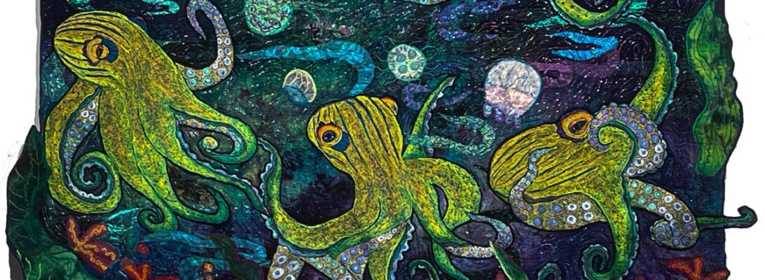
This quilt started from some research where the octopus looked like they were creeping across the ocean floor. Even while swimming. I started to call him creeper.

He’s not that sinister. But he’s definitely hunting.

Sometimes, the title sticks. And you use it. Or you search for something else.

I can’t call this guy creeper. I’ve got to do better than that.

So how do you name your quilts?

Can you help me give Creeper a better name?

The Fourth Pin-Up Girl

If you’ve been following my posts, you’ll know I’ve been on a quest to clarify my process. It started with my process photos. I found I’m quite rigid with how I create work. It always feels like play. But the structure has to be the same, because the steps build on each other.

Pin-ups are a dress rehearsal. Mostly I use component quilting as my work model. I start each quilt with a central image. Then I add embroidered components around that image until it makes sense. At some point, I have a pile of embroidered bits and the background. That’s when I do a pin-up.

Why four? That isn’t rigid. As the pieces develop, you need a dress rehearsal to figure out how they work together. Whenever I’m not sure of the next step, I do a pin-up. Some pieces, I can pin them up and I know. Some take endless pin-up sessions. I place my components into the quilt on my design wall and stare at them for a while.

This one has taken four pin-ups so far.

What have I learned?

  • The octopus must be on an angle to work.
  • Yellow fish are too bright. The orange fish work better.
  • This is a dramatic background but it really doesn’t have a light source. I could build one but it’s busy enough already.
  • Too pink tentacles are too much.

Angle better than straight

Orange fish better than yellow

Overwhelming pink tentacles.

I wouldn’t know if I hadn’t tried it all in the pin-up.

I also fixed the tentacles so they’re better in place.

My best studio tool is the design wall. My most important process is to pin things up and really look. Because if I get it wrong and I stitch it down, I have the choice of it never being right or ripping for days.