Thermal Shock: Eye Opening Color

One of the hardest things in embroidery work is to get over the match instinct. After years of perfectly matching thread to my project, I’ve had to learn to pick out the highest contrast threads to make an image that really shows up.

In embroidery, contrast is everything. If it all mushes together color-wise, then you have a very mushy image indeed. Smooth color exchanges that are analogous and sit next to each other on the color wheel are pretty. But they don’t have much punch. So what you want is color that builds not on similarities but on differences. There are several kinds of contrast: color, tone, clarity, and temperature.

Thermal shock is about the temperature of a color. Every color, no matter whether it is a cool or warm color, leans either towards having a cool or warm cast. It doesn’t matter if it’s a cool color or a warm color. There are cool yellows, there are hot blues. If all the colors are either cool or warm they’ll flow into each other like analogous colors. But if they’re not? You get thermal shock. It’s like standing in a cold-water sprinkler on a steaming, hot day. The effect is kind of visually electric.

Blue and Yellow Don’t Make Green is an excellent book explaining thermal variations and how that creates differing colors. It’s set for watercolor, but it applies to all color theory. It’s a worthy book.

So along with the different hues, there are shade and sun versions of primaries. I’ve been playing with them on this phoenix.

I wanted this bird to jump off the surface. I’d decided to outline with in a yellow that leans into the sun to give it some definition. But I wanted it showy. So the colors I picked, cool orange, cool and warm yellows, cool and warm blues left it shimmery and gave it impact.

So here’s another contrast. All that bright sky and bird against misty grey clouds.


For a final contrast, I put small trees up and down the river, to have that clear cool green against all the soft clouds and the fiery bird.

Always look for contrasts. Blending is beautiful, but to give a piece impact with something as small as a line of stitchery, you need heavy contrast, either in hue, value, or temperature. It creates a pathway through your quilt. But it also makes your stitching shine.

Is This Off Color? Other People’s Perceptions

I spent last week working on three cranes. I was fairly pleased with myself, when someone asked, “Are these cranes having sex?

I hadn’t seen it. I still kind of don’t. I looked up a picture of cranes in love, and it didn’t quite look that quiet. But I have my head in my hands trying to figure out what I do next.

I was inspired by a Japanese textile design in a Dover Pictorial Archive book. I’m pretty sure they didn’t see it as cranes in love. It was my own rendering of it, changed in the way we change everything we draw ourselves.

Usually I let people tell me anything about my art. If it comes from them, it’s theirs. I don’t mess with that. I meant what I meant. I’m not responsible for their response.

But this hits me in a place that makes me feel very vulnerable. Sex is about bodies and bodies are about vulnerability. Art is about visual vulnerability. I’m not really secure about body image. I work in animal imagery since I can’t bear to work in human flesh. I have a delicate detent with my body, somewhat riddled by the failures of old age and memories of high school.

It’s a response to really old tapes. I wasn’t just fat. I was born deformed. Admittedly, it was a small genetic oops. But my mother could build a tragedy out a broken nail.

IF you are harmed enough, people can frame you as being inhuman. If you are harmed deeply enough, you may even think that’s true. If other people think it’s true, they can do anything to you because you aren’t a human being. That was my whole childhood. It seems to be going around globally right now.

I’m not taking this anywhere except in my own life. And I don’t want anyone to explain situations where it is somehow ok. Or tell me to get over it. I don’t believe we get to dehumanize people.

The bottom line is that I’m terrified of naked vulnerability. My animals are me in some way. I’ve come to see my self through Don’s eyes and his vision is kinder than my memories. I usually let that stand. I’m not sure I can be a crane in love on a quilt.

I took the time to reoutline the birds. It usually makes things clearer. Maybe this time that’s not such a good idea.

So what do I do with a quilt with cranes possibly delecto inflagrante? Do I finish it? Put a bunch of cat tails around them? Do I stuff it in a drawer until I feel more brave? I tend to not just throw work out, even if I don’t like it. I could put a lower price on it, and it either sells or it doesn’t. That assumes I can bear to finish it. There’s a dark corner in the closet, perfect for storage.

So what do you think? Would you finish it? Show it? Put a fig leaf on it? What?

Less Is Less: Color Choices for Smaller Images

machine embroidered. not outlined yet.

I’ve whined a bit about larger work this month, mostly because I had 6 full sized pieces to finish. Not fun. But all but one is done.

So in response to that, and in giving myself a break, I decided to do something smaller. These Japanese cranes have been on my mind for a wile. Originally they were on a textile.

People talk about making a smaller version of something and then blowing it up. I’ve never found that works. The size changes what you can do with your stitchery.

When I work large, my thread color choices have to fill in a space. It’s a larger space. I do have a formula for that. And a basic color strategy.

  • I work dark to light.
  • The color of my background is the light within the piece. So that color has to be part of the choices.
  • Everything is accentuated. I choose my colors to be more intense than the overall effect I want
  • Your eye will mix the colors. Even if they don’t seem to go together. Don’t be afraid.

I choose

  • A dark tone of my desired color.
  • A shader, usually either purple, brown, dark green or blue.Often I’ll use a complement from my desired color
  • Several shades of th chosen color.. They can differ in tone and clarity, but they need to be lined up dark to light.
  • A shocker. Usually the complement in a bright form
  • A light color that is the color of the piece.
  • The lightest color. Usually lighter than you want the piece to be as a highlight.

That fills in a lot of space.. It needs to. It allows for some intense coloration.

Smaller work is smaller space. No help for it. The stitching isn’t as intense and you end up with a much small space to fill in. So your choices pull in.

For your thread choices you’ll want.

  • The darkest tone of your color
  • A toner, complement, brown, blue, or purple
  • A mid color
  • Maybe a shocker
  • A light color
  • May be a highlight color

It’s the same theory, but it’s stepped down for smaller spaces. I don’t like to work that way because it makes wild choices feel more intense. It abstracts very quickly

So I worked on these cranes this week. They’re white, but I worked up to that with a lot of soft toned pastels and greys. I was completely worn out on them until I slipped in a bit of turquoise.

I’m not wildly unhappy with this, but I feel limited by it

.The joke is that the ended up fitting into a yard of hand dye, the size I most often use for large quilts.

I don’t often do this, but I have a pervasive urge to redraw the image bigger, and go wild with the colors, just to see what I get.

It’s always good to change things in your work. Any change is a challenge. Chainge the size, change your pallet, change your subject, and certainly at the right moment, change your undies. Change is good.

Tackling the Task: Where Are My Big Girl Panties?

I’ve been prepping for a show proposal for weeks now. While I was working through my machine woes, I couldn’t back and bind the larger quilts. Now that I have a functional 930, I could accomplish that.

Two years ago, I started this heron piece. I don’t know what I was thinking. It’s a heron drawing I found in my files. It was lovely. So I embroidered it and fit it into a quilt.

But it’s large. The word large is inadequate. It’s roughly 59″ x 59″ It’s larger than I’m tall.

Embroidering it wasn’t’ the problem. But after you add a back and a layer of felt, you have a lump. A very large lump.

So it sat the corner. And I became afraid of it. I made a myth of it. It was too large. It wouldn’t fit through the machine. My arms aren’t as strong as they used to be.

I had a friend ask if I could make it work if I cut it up in some way. That shook me loose. It wasn’t a bad quilt, or even a failed quilt. It was just too big. And I was being a coward.

After that I went hunting my big girl panties.

All of those things are true. It’s too large, it did not fit prettily into the machine. I had to jam it under the machine head. And my arms may be less strong, but my will..? Never doubt my will. No one can tell me no but me.

There’s no can’t like won’t, Sometimes we build myths about our work. “It’s so good.” “It’s no good.” “It will never lie flat” Almost all of that is irrelevant. I won’t know i it’s good for some while after I finish it. I need to stop the negativity and just step into the task. It was backed, quilted and bound in 3 days.

Here’s the details on Great Blue

Here are the other quilts I’ve set up for my proposal. I think the heron’s really necessary. Big girl panties and all. Wish me luck.

Wisteria Blossoms

Sometimes hand-dye designs your quilt for you.

I had embroidered a radiated spoonbill landing, and I needed a background for her. This purply brown piece seemed nicely swampy and I loved the range of purple running in an arc through it. It looked like a bower of wisteria, so that’s what I went through.

I’ve done wisteria before. I sometimes feel I can smell them in the studio as I stitch on them

I wanted particularly soft glowing wisteria for this very dark swamp. These were done mostly from hand-painted lace, stitched with poly neon.

And small bright birds sitting in them.

On thing leads to another. The bird leads to the swamp background. The swamp leads to a wisteria bower. And the wisteria need bright little birds.

Wisteria, like roses, sunflowers, and hollyhocks, are part of the garden of my dreams. I can’t help but slip them in wherever their fragrance and illumination are needed.

The next step is to fit everything in together with a pond at the bottom, birds, and small fish.

On the other side of the studio, we have 2 torn-up 930 Berninas. Don has been heroically deciding which will live and which will be a parts machine. I’m working on the only functional embroidery machine, an 807 Bernina from around 1970. It’s a tiny machine, originally for classroom. We’re waiting for the resurrection, which sometimes spreads more slowly than you would like. It means I’m not able to work the 2 large quilts I have laid out at the moment. So….

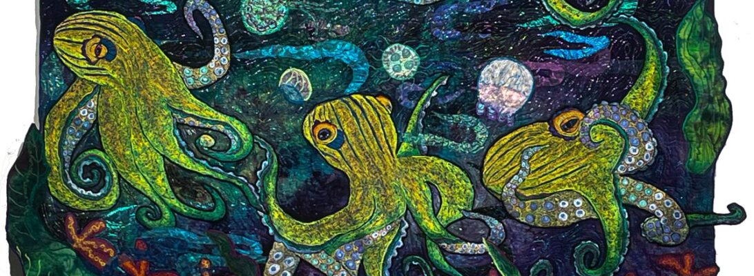
An ocean floor, several external tenacles lots of jellyfish, I think. On a much smaller piece of fabric.

fluffy: Making Feathers with the Long and Short Stitch

This is what I did this week. She’s a secretary bird.

I have to thank John Muir Laws book Law’s Guide to Drawing Birds for its descriptions and information about different kinds of feathers. I’ve been pleased with my pinions, tails and wing feathers for some while, although I wanted them to be less stripey.

I like these pinions. But even with overstitching, they look a bit stripey to me. I’ve been working at overcoming that look by more irregular uneven stitching on the feathers and overstitching.

Body feathers are different. They’re fluffy. They aren’t a part of the flight system. Instead, they are a body cover.

The Long-Short Stitch

I went back to an old embroidery stitch pattern that gave me exactly what I needed, The long short stitch is made by moving your hands unevenly from side to side with your stitching. I made the scallops I would have made for breast feathers, but ragged and without outline so they blend into each other.

Long-short stitch

  • Fills in beautifully.
  • Doesn’t need an outline.
  • Doesn’t need to completely cover the fabric to be effective.
  • Is easy and forgiving.
  • Utilizes a simple zigzag stitch moved from side to side.
  • Progresses nicely. You can add multiple colors of stitchery to build shadow and form without adding a hard line.

The long short stitch in freemotion embroidery has nothing to do with a machine stitch set on your machine. It’s all in how you move your fabric through the needle.

The piece shades from dark underneath to brighter up the neck. But because there’s no internal outline, it looks like fluffy feathers. It’s a bit tougher because we’re shading to white. It needs to look white without actually being a white hot spotlight.

I’m planning this background and sun. Not sure what happens after that. Heavy grasses, I think.

For more information about the long-short stitch check out The Long and the Short of It.

Bird Feet: The Difference in the Details

One of the reasons I like working larger is that I get to play with the details. Smaller images sometimes only need a line of stitching to define things. Larger images allow me to play with color and texture. And the space to make the details count.

There are a couple of defining factors. Are the legs and feet segmented? A solid line of black stitching defines that.

These feet were stitched with progressive colors in garnet stitch, small circles intertwined together.

Does the stitching flow into itself? These have simpler feet and legs with segments.

Does it have patterned stitching? These were stitched in u-shaped scales.

Garnet stitch textures these feet with quieter tones.

Of course, the angle of the legs creates the movement of the bird.

And you can cheat by putting the feet in water.

Different textures, different treatments make the kind of details that define the piece.

Deciding Rather than Designing: Starting from Scratch

I wish I were someone who could take a design and execute it. I can try. It’s a case of man proposing, and God laughing. Instead, a series of decisions are to be made at each point. Each decision points to the next.

One of the most useful things I do in a class is to start a piece from scratch. It’s not like there is a direct list of what you do next. But there are some decisions to be made. It helps to have a plan.

Here is the list of things I need to decide for each piece.

  • Background-The hand dye creates the light and the atmosphere for the piece. It usually is the first choice. Does it have a sunspot? A pool? A field of flowers within it? It dictates almost everything, especially the lighting in a piece.
  • Major Images-These are the main focus. I draw them in Totally Stable, backwards. They iron on to the back of the piece and remain inside the piece as a pattern.
  • Atmospherics-Water, light, smoke clouds, and sometimes leaves and flowers are atmospherics. They are usually made of commercial sheers, handpainted lace, and dyed cheesecloth. They make a translucent presence in the piece.
  • Details/pathway-These are smaller embroideries, or stones, or leaves that can be used to create a visual pathway through the surface.
  • Texturizing the surface/stippling- after all that embroidery, the rest of the piece needs to be integrated. The stippling over the surface can pulls the piece together.

There are no right or wrong answers. There are simply decisions. Each defines the piece. What I choose not to do also shapes the definition. I’m OK with that. I’ve learned that each decision I reject can be featured in the next piece. Or the one after that. I’m not making one perfect piece of art. I’m creating a body of art that explores the limits and range of my techniques and my skills.

This piece, like most of them, started with a piece of fabric and the idea of herons. I dye a number of pieces of fabric as cenotes, wells of color. Some times the cenotes make a light source, but this piece made a wonderful pond.

The birds started as whistling herons. But at a certain point, they were indistinguishable from the Louisiana Blues. So I did them as blue herons. It’s important to finish the major embroideries first because they shrink. You don’t know how they’ll fit in until they’re embroidered and cut out.

The atmospherics for this piece are water and grass. The grass is an oil paint stick rubbing of a ceiling tile. The water is accentuated with c-shapes of hand painted and commercial lace. Then I put in rocks to anchor the pond and direct the eye.

I decided on damsel flies and grasshoppers, as pathway elements. They did not work the way I had hoped. The damsel flies fit in, but I’m not sure of the grasshoppers. I’ll have to finish them to be sure.

Finally, I wanted seedlings growing up through the water. I made big beautiful bold seedlings the size of God’s underpants. Again, not the best choice. I scaled that down and it was much more effective, although I might want bigger ones at the bottom.

This piece is pinned in position. I’ll be stitching soon. But most of the decisions are made, step by step, before it’s stitched down.

Yellow Birds: Following the Compulsion

Anyone who has written an art statement knows that meaning is illusionary. I think it may be whether you are visually oriented or verbally oriented. Verbally-oriented people can tell you what everything means. They understand their visual architecture. I find them fascinating because I can’t do that.

I get haunted by images, by different animals. and by small worlds. I work with those images until I’ve worked it out. Sometimes I have an idea of what it means. Mostly I don’t until and only after I’m long done. Somewhere my mind must know what it’s about. But it’s not conscious. Instead, the images need to work their way out.

This year, I’ve had a compulsion for little yellow birds.

Those of you who know me well, know I had a rough time in high school and before. I was targeted by people who chased me, hurt me, and humiliated me, while other nice little apaths stood against the wall and watched snickering. I do not want to hear I should be over this. You don’t get over this. It’s happened and it’s who you are, forever. Because it happened, you live in a world where it always could happen again.

It’s not that I remain a victim. It’s that I have no patience with bullies, sociopaths, apaths, and people bored enough to do this for fun.

So most of my quilts are social commentary. They’re about living in a dangerous environment where there are predators. They’re about finding a safe way through.

Not safe, necessarily. Livable.

So in a world where we are discussing canceling peoples’ basic human rights, we’re not to complain, and where we’re supposed to trust a rapist to protect us, it seems no surprise that I’ve had little yellow birds finding their way through my quilts.

May they find their way. May we find ours.