
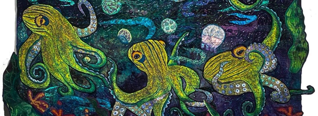


Recently, I was working on the rocket octopus’s background when I made a pretty large boo-boo. I was putting shell rubbings along the bottom. I got turned around and put them down the side rather than at the bottom. This was my best original pin-up

As boo-boos go, it was pretty bad. I can turn the quilt on the side as if my rubbings weren’t a mistake.

None of the answers for that were great. I could turn the quilt over and use the other side. There’s no backside to hand-dye, so I could do that. I’d lose the darker right corner, and I knew I’d miss it.

But that made me realize. This is one of the decisions we make before we take a stitch. It changes how the whole quilt works.
A vertical layout pulls the eye up, just by its nature. It removes the subject from us a bit. It creates a distance.
A horizontal layout gives a more expansive and inclusive view. It welcomes us in. There’s space for us in the imagery.
Is either of these things wrong? Of course not. But it’s worth knowing what that tells us within the piece.
These are the decisions we make before we take a stitch in a piece. I suspect that unless we’re forced, either by error or design, to change it, our original idea is probably the right one. The eye knows long before you can explain it to anyone. We make the right decisions, even before we know the question. It’s a serious visual clue at the heart of the design.

We are talking about a visual structural language: communication through images, shaped by how they’re ordered within the piece. It’s not verbal. The positioning itself communicates something we need to know about that piece. Another orientation wouldn’t be wrong. It would tell us something different.
At this point, I think I have the right orientation. If I swap my red and blue octs, it may even work.
What do you think?


