Going Straight: Stretching into Different Stipple Patterns

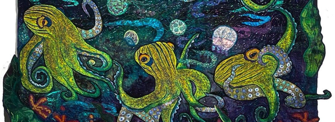
I’ve been working on the octopuses for around five months. There are seven in all, five finished. I’m pleased to say they make a good start for a show.

But I don’t want quilts that look like the same pieces, only in different colors.

What defines a work? Certainly subject matter. Certainly color. But textures also make pieces stand from with each other.

I’ve leaned heavily into oranges and blues on this collection, but I think there’s a good range of colors. The background is always the color of your sky, the mood of the piece, and its definition

The octopus’s garnet stitch texture connects the grouping.

Something more subtle separates them.

The stipple treatment establishes the movement of the water, but it also visually separates the pieces from each other.

Confession. Left to my own, I have three stipples I use. I really felt I needed to stretch a bit here, particularly because I want the quilts in this series to stand up as separate works.

Version 1.0.0

Leah Day’s book, 365 Free Motion Quilting Designs has become a go-to reference for me. I don’t feel a need to copy her designs, but it’s full of a lot of stimulating ideas. It’s one of the few books I store right by my machine. It’s a worthy resource. I turned to it for some different stipple ideas.

I almost never do straight lines in my work. I’m not very good at them. But I love the bubbles and stripes here. It’s almost like wallpaper for the quilt.

Here are details of the other quilts, showing the different stipples.

Leah’s book is a lovely springboard into other possibilities. It’s available on Amazon

So I went straight on one of them and survived. Maybe I can do straight lines.

Shimmer: Defining the Background

I have two quilts I’m finishing right now that you’ve been watching me work on. The threads I choose make all the difference in their background effects. Shinier threads will create a shimmer, a wet or wild area. Less shiny threads are more indicative of air or ground. I’m treating them with different threads and patterns to create a specific effect in each case.

For a very wet look, I’ll use Sliver and other flat threads. These really shine across the surface. I prefer them for either starry nights or for water.


The other thread I’m using is Madeira’s bug body thread, FS2/20. This amazing thread has a black core that gives it a very different texture. Zigzagged it does look like bugs. As a stipple it has a sharp look without the intense shine.

I consider both these threads incredibly beautiful and essential. But I use them very differently. Because they create an incredibly different texture. Why is that important? The texture defines the area for our eyes. Shiny thread will create that wet feeling. A sharp undefined metallic does excellent air or dirt, all defined in our thread choices, with no more work to it than that.

Green Heron Hunting is set with water, air, leaf, and ground elements. The air and the ground are very similar. I don’t want a soft look. It’s fall, so I want it to be crisp and textured. So I chose Sliver for my stream. But the ground area with the frogs and the leaf tree tops are stippled zigzag with the FS2/20. There’s a glint of metallic, but it’s different from the high sheen of the water and the eye separates them immediately.

For the air, I chose a driving straight stipple pattern to suggest wind. But I put in a repetitive garnet stitch in it to make it look more driven.

For Fishy Business, the background is all water. So I used Sliver-type threads exclusively. The very shimmery background contrasts highly with the completely poly-embroidered fish. They both shine, but in very different ways.

Your thread choices and stipple patterns define the background. Contrast is the key. If your background and images contrast each other, they will stay visually separate, and help your eye to see the separation.

If you’d like more information on stippling and threads, check out. Skimming the Surface: Bobbin Work as Stippling.