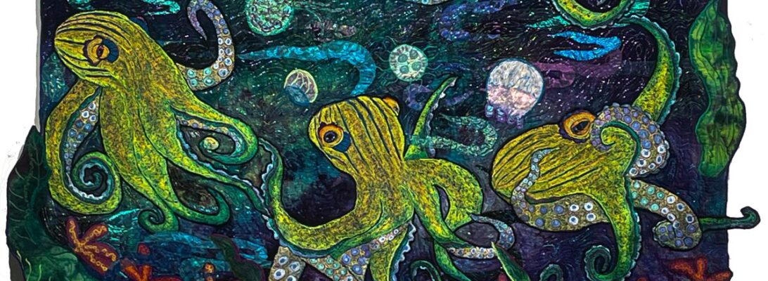
Every image has to be attached to a quilt at some point. There’s more than one way to accomplish that. But the one I use most is a solid black line of polyester zigzag embroidery.
That sounds dull, doesn’t it?
The black poly outline does more than you would suppose. It creates a crisp outline.
I’ve tried using other colors. Bright, light, neon colors. Nothing gives the same punch as black.
It’s not true of flowers. I can use a bright color outline on a flower that pops it perfectly.
The outline defines the edge visually. If you want it to show up across the room, you’d better make it bold. The outline is the finish line.
I’m just finishing outline octopus 4. One nurse shark is outlined. One is not.
But it does two more things. It makes the image puff just a little. I like the 3-D effect.
And it holds images down solidly. These embroideries wave around the edges like the flag on a windy day. A light line of stitching does not hold them down well enough.
I did not need to cut either the sharks or the octopuses, to get them to lie flat for this quilt. All of it was done with a heavy black outline. The thread traps the edges and mashes it into place.
I used to use black metallic thread to outline metallic images. But since that has to be done with metallic thread in the top, it’s an all-day sucker. Takes forever. Endless breakage. The polyester thread doesn’t have the same shine. But I only have so much hair I can pull out in one afternoon of sewing.
I’m always astonished at how much an image can change with positioning. One of the advantages of component quilting is that it can be moved endlessly to get the placement right. I went to embroidering large images some while back. But I’ve learned several other things component quilting allows me to do, and I use it constantly now.
Changing Processes
Three changes in my process made this work: component quilting, pin-ups, and daily process photos. I work with components rather than images stitched into the work. I do multiple pin-ups for placement, and daily process photos that let me track the changes.
These are all relatively new for me. But it wasn’t something I planned. I just happened to find these processes helpful, and now do them regularly just in my studio work.
Component Batch Quilting
Batching a number of elements at once allows freedom later on in the project. Instead of just doing the larger images, almost all of the embroidery is on a separate sandwich, ready to cut out and use.
I’m free to change my mind about each element. If I embroider a moth in the piece, that’s where it stays. Right or wrong, it’s not going anywhere. You live with your choice. If the moth is separate, I can move it indefinitely.
I can make images from the same color choices that are in the same range but unique.
I can always use whatever is left over. There are never enough fish, frogs, bugs or birds.
The first pin-up is where I design my quilt. Once I put the quilt top on a sandwich, I put my main images in, see where they might fit, to rearrange things.
But the first pin-up is only a beginning. In this case, I did my pin up, added my elementals, and pinned it back up with those included. My original intent was to have the octopus learing over the top kind of like Cthulu. But it was flat.
So I gave it a twist. To make something move, put it on the angle. I angled the octopus, to put him into motion. Then I angled the other elements to echo that motion.
Picture This. by Molly Bang, is the best book about composition. It’s about how people process imagery. First, she illustrates Red Riding Hood with rectangles and triangles. And she made it work.
But she explains how we see things, what meaning we take from images.
If you are an artist, run out and buy this book. Then buy another 5 copies, because you’ll want to give it to every artist you know.
She has some very useful observations. Horizontal lines are stable. Vertical lines are stable. Angled lines look like they’re falling. If they’re falling, they’re in motion.
I angled the octopus to echo the left jellyfish.
Then I angled the nurse sharks to echo the octopus.
Daily photography
Having daily process shots gives me so much information about what is and isn’t working in a piece.
Including a black and white picture to evaluate values.
I’m always surprised at how much a little twist can do.
Octopuses have put me in the land of the garnet stitch. It creates. textire and pattern, all within it’self.
Garnet stitch is one of the great non-programmed stitches. it’s simply moving your hands free motion in circles. Check out the Variable Garnet Stitch for more information about the stitch.
Garnet stitch has another very useful feature. You can always see the background behind it. Sometimes that is to be avoided. I pick my embroidery background to match the overall background carefully, so only the stitching stands out.
But sometimes I want the embroidery background to shine through.
This was one of those times. The background for this piece is darker and moodier than the other pieces in the series. I needed something to lighten it up. So I used a very odd cream and green background. I love it. I have a green and cream light octopus in a dark sea.
We are on to the pin up stage for octopus 4. That’s always the moment of truth. You know if it’s going to work at that point.
Because I’ve made small metallic fish and 2 nurse sharks, I have my components to fill the space and set a path. I’ll tweek it some, but the design is pretty much there.
There’s a lot of stitching left, and I need to do my water layer. But I’m confident I’m going to like this piece.
Just to show you where I am in the octopuses garden, here’s the pieces so far.
One more at least to go. Does it look like a show yet?
I have a very hard time when things finish. I’m an INFP for those who know Myers-Briggs. I’m happier with things left open, possibilities, choices, options. That moment when something is finished is joyous, but it’s also an end, a loss, as well as a win.
This could be an excuse for the large pile of unbacked and unbound quilts sitting by my machine.
.I have a friend I just heard is dying. One of those good and bad things about getting older is that we sometimes have thirty-year-old friendships. It’s like the world shuts a window that was a bright and different view.
I don’t know how to say goodbye to a friend from that long ago. He brought me wonderful art books helped me write and publish my first fiction writing, and took me to my first country dance. Wonderful gifts. I sent chocolate Haagen-Dazs, soup, and M&Ms. We bring whatever bits we have.
I hate watching things end. Even in art.
There’s an energy to art that might be its largest purpose. There is a connection between you and your art that wizzes around the room, even in the duller processes. I do believe art is alive. It has an energy of its own, and it communicates what should happen next. It is not your child. It’s a partner in co-creation. While you are making it, it’s remaking you.
There is a finish line, a moment where the last stitch is stitched. The energy stops swirling. There is an end. It’s wonderful, but something is lost.
But at that separation, something else happens. The connection between the art and the artist is cut like an umbilical cord. But art finds its own place. In someone else’s world or heart, it goes on to do other things for other folk. Art soothes people, riles them, teaches them, inspires them, but most of all, it changes them. If art is really good, it lives past you. Nothing really ends. It moves into the next space. Other challenges. Other purposes.
I’ve peppered this post with photos of the quilt I’m currently finishing. We’re stippling today. Almost done. It’s a good thing I have another quilt waiting in the wings.
Outline, dark base, shader, and the beginning of the blue range
The nice thing about color theory is that it works across all kinds of media. What changes isn’t the color theory, but the way the media is applied.
Color theory for thread is different only in the fact that you really don’t mix colors. Instead, you lie them next to each other, and your eye mixes them.
These nurse sharks are part of my octopus garden. I don’t have their octopus stitched yet, but they were compelling. I love the spiky shapes. They will have orange-yellow stripes. I’m not quite there yet. Right now, I want them round and shaded, with a clear indication of which side is up. I need smooth color for that.
Smooth color creates a color range.
The formula for it is
A dark base color
A dark complementary color as a shader
A range of colors in the base family
A bright color as a shocker
A lighter or brighter shade of the base color to finish.
If the subject is too large, I can zone the areas of the image and repeat the formula in a set of lighter or darker shades.
I usually work light to dark. The last color will be the most prevalent, so keep that in mind. Sometimes with fish or frog bellies, I color the dark to middle section, add the lightest color on the other edge, and work in my darker colors, so the tummies aren’t so blatant.
Green as a shocker
I chose green as my shocker color. Usually, I would have used either the blue or purple complement, but orange is so strident. I will use yellow for the stripes, but I think I’ll brown them out so they don’t scream at me.
It takes a fair amount of courage to add the shocker. The shader layer makes visual sense. The shocker layer screams at you. There’s a terrible urge to rip it out immediately. But it quiets down once you put the next layer of the base color. And the color is smooth without being bland. The shocker is an electric spark in a range of smooth, quiet color.
It’s time consuming, but I love the base colors. Between the shocker and the shader, the color has a splash of excitement, but creates a flow color base.
What will they look like with yellow-orange stripes? I expect they’ll be quite jazzed up. I’ll show you next week.
I never used to think about how a quilt would be viewed. Was it pretty? Did it move? Did it tell a story? Did it change people to see it? I never thought about how the size of the space around it affects what the viewer sees.
Now I’m keenly aware of the space a quilt will hang in. I don’t have any control over that when I sell a quilt. It goes where the owner wishes. It becomes part of their house and their lives.
But small work is viewed differently, just by definition. Small work is made to be examined. You come up close to see it. Every detail matters and is exposed.
Unfortunately, most small work isn’t really that visible at a distance. It’s made to be intimate. Your relationship with it is within its small space. It fills a tiny space with an explosion of color and detail.
Larger works have a harder task. Done well, they will pull you from across the room. The movement and the color should sweep you in. But once you’re up close, the detail should amaze you.
When I first started using rubbed fabric in pieces, they were all experiments. I worked very small, partially to learn and partially to see how they would be received. I was limited by the size of the rubbing plates. The largest were under a square foot.
I’ve worked hard to find alternatives since then. I’ve used ceiling tiles and texturized surfaces. I’ve learned to make my own rubbing plates from modeling paste using stencils. So my options have expanded not only in size but in possibilities.
With these octopus quilts, I’m using the rubbings as objects themselves, rather than backdrops. Mostly, I did seashells and jellyfish.
I love the rubbings I’ve done for this. But they need something to pump them up to be seen across the room.
I usually use straight stitch #40 poly thread to match and shade the rubbings. That’s exquisite on a small piece. It’s almost invisible at a distance. So how do we pump it up?
I chose to stitch my jellyfish in white. I rarely use white. It’s too bossy. But for this piece, white thread pumps the jellyfish up.
I chose to outline with a very small zigzag. It’s a subtle difference. But it does define the line.
For the seashells, I did not outline. Their shapes were visible enough.
The downside of this much stitching is that I have some distortion. We can fix that. Where’s my iron?
Over the last couple of months, I’ve been working on a series of fish in the waters. This is an important symbol for me. It explores surviving strange waters, rising out of the depths, swimming with the current, and swimming against the current. It’s about flowing water and changes. It really checks all my boxes. It also serves as a connection with my father, whose religion was bass fishing. Since going fishing made better people than going to church, I respect it deeply, even if I won’t eat fish. I live in water.
So I noodle at the fish-in-the-water image often. If you’ve been following the blog, you know I made one quilt I loved, and I wanted to see whether I could recreate the energy. Not the fish or the river, but the energy of the piece.
Epic fail. I made a very nice other piece with similar hand dye, a fish I drew 5 times before I was pleased, and similar oil paint stick rubbing for the forest in the background. I hated the first fish I embroidered. I stitched a more active catfish, that was better.
Then I took a break and went to find the studio floor. Again. Everything flutters to the floor except the things that go clunk.
There it was, the best background for the embroidered fish I rejected. The fabric made a vortex, so I did too, out of stitching a swirl of sheers.
I didn’t learn anything technical from the exercise. But I did confirm what I already knew. It does me no good to recreate something. Another piece will need different components and approaches. I didn’t need to be making arbitrary rules for myself. I needed to listen to each piece to give it what it needs. If I thought I was in control, that was delusional.
Maybe this is a right-brain, left-brain thing. I’ve been struggling to organize both in the house and the studio. That’s a very left side of the brain thing to do. It’s foreign thinking, but it’s less grim than Swedish Death Cleaning. You know what? No one ever did teach me this. Certainly not my mother.But that shouldn’t stop me. If you don’t know how, you can learn.
So cleaning does turn into art. Eventually.
As Don says, “I’m a man. I can change. If I have to. I guess.”
I can too. If I have to, I guess.
Of course, I hung the quilt up and noticed that the wonderful spiral stitching in the center is unnoticeable 3 feet away. Small flowers and thick thread to the rescue. Of course, the pond has floating flowers.
The change isn’t a technique or a new technology, really. The change is learning to listen better.
Last week has been spent in fish production. I can’t really put in the octopuses until I have the fish to create the path around them.
Usually, fish have scales, and the scales divide the space..You progress from scale to scale, picking lighter colors as you get to the underbelly. You fill in the scales darker on top and progressing through lighter colors around the belly. It’s pretty. It gives depth.
What if you don’t divide the space? You can stitch row after row of color next to each other. It looks stripy. There’s a place for that, but it’s not very natural.
It doesn’t work for clown fish.They blend from one color through another without separation.
So how do you fill in a larger space? One way is the short and long stitch.
You need to understand that none of this is a stitch on your machine. It’s all zigzag stitching. The change is the angle in which your fabric goes through the machine.
The long and short stitch is done from side to side. The difference that it spreads from both sides and fills in unevenly, shading the area softly and without stripes. The top and bottom of the image has a solid line to outline.
That kind of shading allows us to put in darker contrast colors to shade that blend right in. These fish are shaded with a dark and then a lighter purple. Since the colors are mostly covered with orange thread, your eye blends them into a shaded solid orange.
All of this is for the octopus’s garden. This is my second pin-up. I think it needs one pillar rock and some water, but it’s ready to back, and stitch.
A while back I decided to see if I could recreate the energy from a piece I was particularly pleased with. If you’ve been following the blog, I’ve documented it as I’ve worked.
I wouldn’t call it a success. I went through three separate fish, not happy with any of them. I embroidered the best of them and still felt bland.
So I passed on the bass and did a catfish, which I’m not displeased with. The bass went back into the pile.
I can plan all I want. There’s a serendipity to art that is inescapable. While I was scraping out the studio, I found a piece of fabric I’d totally forgotten about.
All of a sudden, my wallflower fish had gone dramatic. I built him a whirlpool/vortex.
My fish fooled me again. I spent some time embroidering some nice metallic minnows that shyly blended right into the background.
They are pretty, but they have no punch.
So I’m trying these brighter gold minnows. I’m still not sure. They’re embroidered from poly, and they might stand out too much. I may need to do some from metallic gold.