Making Rocky Roads: Rocks Out of Cheesecloth

texturized pebbles

Once I find something that works, I tend to stick to it. A creature of habit, like anyone else. What pushes me out of the box? Mistakes! Misorder! An inability to find what I need! Basically, it takes a catastrophe. Fortunately, it doesn’t have to be a big catastrophe for it to do the job.

I really love using rocks in my work. They weigh a piece. They can form a visual line. They add a dark shadow or highlights depending on your color choices that frames the piece. They identify the bottom of a piece.

972 Shelter from the Storm unstitched rocks

I’ve used hand-dye for years for rocks. It already has that mottled texture and color. I used to soft edge the appliqué so the edges weren’t as obvious, but I’ve come to like the shading I can do with black thread. Inner shading works better with a straight stitch. Outside edge works best with a thin zigzag top, and a heavier shaded bottom.

texturized rocks

I sat down and started cutting rocks for the Octopus surround and realized, I didn’t have enough rock fabric. I dye greys and browns specifically for rocks, But there is almost never enough. And greys and browns are regular backing colors I use all the time. But if you’re working on three quilts at once, that’s a lot of rocks.

They also need to be differing colors. Rocks are never all the same. That’s part of their charm. They need to fit well enough to be identified as rocks, but they need a separate individuality to work.

Earlier this year, I ordered a box of cheesecloth. I use dyed cheesecloth for leaves, flowers, and other translucent things. I bought a box of cheesecloth at Joann’s every year or so. That cheesecloth was a uniform open weave,

Now that Joann’s is gone, I found that cheesecloth is graded in sizes by the number of threads per inch. Makes sense. It’s how we class thread and fabric.

I overestimated and ended up with a much tighter weave of cheesecloth. At first, I thought it wasn’t a problem. Then I realized it was much less transparent and much more like regular cotton.

I’d dyed a batch that sat on my table for a long time. It lacked the same transparent grid of the lighter-weight cheesecloth, and didn’t do the texture of leaves as well.

When I went to clear the table, there it was, in about a dozen browns and greys.

So if I use cheesecloth for rocks, what changes? I have to choose a background that will show through. The weave will show through as a grid of sorts, but that can be pulled in different directions and stretched.

Normally, I stitch my rocks on black felt, because it gives me an edge that fits with the stitching. If it’s all backed in felt, it should work.

Interestingly enough, what changes is how the stitching looks. Straight stitching sinks into the texture of the cheesecloth and is less visible. But the cheesecloth makes it more textured.

I’m not sold on cheesecloth for rocks, but I think it works here. I can always stitch heavier.

A Series of Lessons

Over the last couple of months, I’ve been working on a series of fish in the waters. This is an important symbol for me. It explores surviving strange waters, rising out of the depths, swimming with the current, and swimming against the current. It’s about flowing water and changes. It really checks all my boxes. It also serves as a connection with my father, whose religion was bass fishing. Since going fishing made better people than going to church, I respect it deeply, even if I won’t eat fish. I live in water.

So I noodle at the fish-in-the-water image often. If you’ve been following the blog, you know I made one quilt I loved, and I wanted to see whether I could recreate the energy. Not the fish or the river, but the energy of the piece.

Epic fail. I made a very nice other piece with similar hand dye, a fish I drew 5 times before I was pleased, and similar oil paint stick rubbing for the forest in the background. I hated the first fish I embroidered. I stitched a more active catfish, that was better.

Then I took a break and went to find the studio floor. Again. Everything flutters to the floor except the things that go clunk.

There it was, the best background for the embroidered fish I rejected. The fabric made a vortex, so I did too, out of stitching a swirl of sheers.

I didn’t learn anything technical from the exercise. But I did confirm what I already knew. It does me no good to recreate something. Another piece will need different components and approaches. I didn’t need to be making arbitrary rules for myself. I needed to listen to each piece to give it what it needs. If I thought I was in control, that was delusional.

Maybe this is a right-brain, left-brain thing. I’ve been struggling to organize both in the house and the studio. That’s a very left side of the brain thing to do. It’s foreign thinking, but it’s less grim than Swedish Death Cleaning. You know what? No one ever did teach me this. Certainly not my mother.But that shouldn’t stop me. If you don’t know how, you can learn.

So cleaning does turn into art. Eventually.

As Don says, “I’m a man. I can change. If I have to. I guess.”

I can too. If I have to, I guess.

Of course, I hung the quilt up and noticed that the wonderful spiral stitching in the center is unnoticeable 3 feet away. Small flowers and thick thread to the rescue. Of course, the pond has floating flowers.

The change isn’t a technique or a new technology, really. The change is learning to listen better.

Woman Proposes, Art Laughs

A while back I decided to see if I could recreate the energy from a piece I was particularly pleased with. If you’ve been following the blog, I’ve documented it as I’ve worked.

I wouldn’t call it a success. I went through three separate fish, not happy with any of them. I embroidered the best of them and still felt bland.

So I passed on the bass and did a catfish, which I’m not displeased with. The bass went back into the pile.

I can plan all I want. There’s a serendipity to art that is inescapable. While I was scraping out the studio, I found a piece of fabric I’d totally forgotten about.

All of a sudden, my wallflower fish had gone dramatic. I built him a whirlpool/vortex.

My fish fooled me again. I spent some time embroidering some nice metallic minnows that shyly blended right into the background.

They are pretty, but they have no punch.

So I’m trying these brighter gold minnows. I’m still not sure. They’re embroidered from poly, and they might stand out too much. I may need to do some from metallic gold.

I’m in charge. Right.

Building An Ocean Floor: Seashells and Pebbles

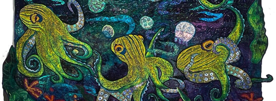
I’ve been working for some time on my octopuses, and I’ve begun to build up backgrounds. I’m working on three of them simultaneously. It’s complicated. But if I work one piece at a time, changes in construction creep in. It’s almost unconscious. I may have worked the water a different way, or the rocks are different, and won’t fit in. This way, I’ll have three pieces that flow into eachother seamlessly.

This week I worked on seashells and jellyfish. I’ve been collecting stencils ( there are no commercial seashell rubbing plates I know of) to make rubbing plates. I used foam board for a base, and modeling paste to make rubbing plates of the stencils. You’ll find full instructions for this in Modeling Paste: All it Needs Is Peppermint Flavor

I used this rock backsplash I got from Lowes to make the pebbles.

This is one of the backgrounds I chose for the octopuses. I’m still not sure about Octopus 1. I’m tending towards the green-blue background. I wanted seashells and pebbles on the sea floor, and jellyfish floating above. I found I couldn’t place them correctly all at once. I put in the shells, then the jellyfish and finally the pebbles.

It’s a work in process. I’m waiting for them to dry to get the next photos and then we’ll add what’s needed. I think today will be cloudy with a chance of fish drawings.

Octopus Family Planning Two: The Pin Up Girls

You can blame this on three stinky days when I couldn’t get to the studio due to bad weather and hinky cars. I do not do well in captivity.

Usually, when I’m working on a piece, there’s a moment when I sit with 3-4 backgrounds, deciding which will work best. What I’ve found is that the background tells the story. The image is the who. But the background is the where, what, and when, Here’s a blog that talks about it. Telling the Story: The Background Changes Everything.

So I pin up backgrounds and move images from one to the other until I have the background that either shows up best or explains things better.

With three pieces in a display, that’s overwhelming. My arms aren’t that strong. So I’m going to use Photoshop and the art boards to interview my fabric choices. I don’t need to see the actual placement. I need to see how they go with each other. The octopuses are my pin-up girls and this is a virtual pin-up.

What am I looking for? What do I need my backgrounds to do?

  • They need to be 45″ tall
  • They need to match in intensity
  • They do not need to be blue
  • They need to flow into each other
  • They need to show off each octopus well
  • In the end, just like Highlander and Sudoku, there can be only one chosen for each octopus. There is no way of reproducing hand-dye.

I need to say this was not seamless. Photoshop seems to change every ten minutes, and I was not up to the latest artboard information. But it’s given me a chart to help me decide what works best.

I chose my fabric so I’m looking at 1 yard pieces, 36″x 45″. The edges will be irregular, so they don’t need to be exact.

My third octopus is not completely done and is only partially cut out. I don’t think that will make a big difference.

Here are some of my best choices.

This is a reasonable amount of pin-up. Once I’m back in the studio, I can put up the best choices and turn them in different ways. Strangely enough, the orange went with everything. I’ll put them up on the board and fussy-place them to settle it.

Would I have done this if Don hadn’t called a winter day off? Maybe not. The cats and dogs are way out of the way. That may have involved screaming at the computer. It was not simple. At one point Photoshop locked up and we had to give it the purge. No, I’m not kidding.

But it did give me a way to sort my tops all in one piece.

Why am I fussing? I’m planning on a layer of rubbed sea shells and pebbles on the bottom of each. I’ll get one crack for each to get it right. Testing out my options just seems smart.

Planning a Surround: Family Planning for Octopuses

I’ve been noodling around the idea of a series planned as a surround. I’ve done many series over the years, but this is different.

I suppose you could plan a series. But I’ve never seen it happen. You do one quilt with a subject that is either so fun or compulsive that you do another five more. That’s an organic process that I enjoy. But it doesn’t lend itself to consistency.

These birds just happened. I love the shape of them, the bills and that crazy pink coloration. So I’ve made a number of roseated spoonbills.

We’re talking something different here. A surround has to be planned so that each piece flows into the other one. I can do that somewhat with the drawings. They need to flow across the different quilts into eachother. I can do that somewhat with background images. Rocks and seashells can make a pathway. I can also do that with small fish. I’m thinking of clownfish and something small and gold in color. That is the plan.

The coloration should be easy. The hand-dye needs to be all of the same intensity, and we’ll keep the octopuses bright. They should fitin with each other well.

The first octopus is embroidered and ready to place in background elements.

The second octopus is almost embroidered. I need to outline the suckers.

He’s already had a large change. Originally, I had one sucker tentacle closer to the head. It worked in the drawing but not in execution. So I cut it out, and moved it. I think it works better.

shell rubbings from another project

The next steps will be tricky. I plan to rub seashells into the fabric on the bottoms of all of these. They’ll need to fit into eachother. I’m not sure if I can display them all on one photo wall. But they need to dance across four pieces altogether. The last time I did something this large, I hung it off the back porch of my apartment building and walked down the alley to where I could see it as a whole. That was three homes ago. We’ll need to figure it out.

I’ll keep you posted as I work on this. I think it’s going to be a wild ride.

2025: A Year of Experimentation

I didn’t have any shows this year. Which is ok. Every artist has ideas they aren’t quite sure how to approach. Instead, I spent a lot of time trying out ideas I wanted t do my quilts. That takes time and effort. It messes with production significantly. So I’m glad to have spent my studio time this last year in this way.

I learned how to make waterfalls.

I learned how to make a reflection of my subject in water.

I worked on seashells and tenacles.

I experimented with extreme borders.

I learned to make my own rubbing plates from stencils.

I learned to incorporate those plates into my work.

I worked in desert landscapes.

I finally worked out the cat head fountain.

It’s been a good year for learning. If you’ve followed my blog, you know, because each week I show you what I’m working out, working on, and working through.

Here’s to 2025:

Major quilts

Small work

Unfinished work

I couldn’t do this without your support. Not necessarily monetarily, but spiritually, personally, and energetically. No art is in a vacuum. I suspect that I would do art if it were just me arranging deck chairs on the Titanic, but your company on this journey has made it much more worthwhile.

Thank you!

Not the Same River: Not the Same Piece

Last week I showed you my experiment recreating the elements of a piece I thought was particularly effective. At that point, it was speculative. You can read that at Again? Really. Yes. Really I’ve spent a week on it and here are my results.

I divided the parts into elements. Here are the elements I was working with.

  • The focal image
  • Hand dyed background
  • Oil paint stitck layer
  • Sheers layer’
  • Small elements
  • Background stipple.

What do these elements do?

  • The Focal Image is the answer to who. Ir creates the subject and focus of the piece.
  • The dyed background is the answer to where and when. It creates the light in the piece. It also defines the environment.
  • An oil paint rubbed layer is the texture of a piece. I don’t use it everywhere, but it gives a somewhat translucent surface without sharp edges. You can see the background, but it has shifted in color and appearance.
  • Sheers make another translucent shift across the surface. It transforms the background color and creates movement. Sheers have defined edges, but don’t have a visible thread edge.
  • Small elements can be used to establish a visual path. Flowers, rocks, leaves, bugs, birds and frogs can all point a direction through the piece.
  • Stippling changes the coloration of the surface. It creates dimension and defines light and dark.

I think I’ve failed on this piece. It’s not bad. It just isn’t as good. Why?

I’m reasonably sure of my background and my oil paint rubbing layer. The sheers can be dinked with.

I didn’t get to the small elements because I’m just not content with my drawing. These fish will add movement, but I don’t think they’ll help enough.

Oooops. Sometimes I don’t know until I get the piece embroidered. I drew other fish for this. This was the best of them, but it’s just not dramatic enough. I need a drama queen fish.

Here are the two drawings I rejected. I’ll save them for another piece another day.

I could push through. All the elements are there. But the experiment failed. I took similar elements, and they did not create the same energy.

I could blame it on the weaker drawing. That would be fair. But I suspect that the energy of the piece itself is different, and probably can’t be reproduced.

Will I throw it out? Heaven’s no! I can always use an extra fish. This one just doesn’t belong here.

So, as a rest, I’m back to octopuses. The fish piece is on the wall, aging like fine wine. It will find its time.

Fallow time seems to be an important part of the process as well. Repeating the same elements doesn’t always create the same energy. The parts just aren’t the sum of the whole.

Again? Really? Yes. Really.

I try really hard not to rate my pieces as I make them. I find that my opinions of things change over time, largely in reaction to people’s reactions. If I suspend my judgment of work, I find I learn more from it. Suspending judgment allows me to flesh out ideas and move on. Finish the quilt. Next quilt, please. The learning is the goal. The quilt is almost a byproduct.

But sometimes I do a piece that knocks my socks off and throws me across the room. It’s not an everyday thing. When that happens, I find myself asking some of the same questions that I ask when I do something I hate. What happened here? Why is this piece wonderful? Or awful? What?

Was it the color palette? Technique? Is it about my background? The image itself?

A fabulous piece makes you think, “Can I do this again? How did this happen?”

I love this piece so much. So I’m going to try not to reproduce it, but to focus on its successful elements.

Part of what I love here is the quiet palette. I normally go for eye-sore colors. This was restrained. Luckily, the last batch I dyed had a piece, not exactly in the same palette, but in the same tone.

The fish can be the same threads. And I think it needs to be.

I had trouble with the fish. I wanted a fresh image, not the same, but in the same colorations. So I started several fish, only to find them wrong. I love these. But in terms of direction and size, they’re just not right.

I went through my collection of drawings. My embroidery process uses a pattern drawn on Totally Stable that goes into the back of the piece as a pattern and a stabilizer. So each drawing is consumed by the embroidery itself.

Not to worry. For the last 3 years, I’ve saved a tracing of my drawings for later. It’s turned into a jumping-off point for other pieces, and I consider that collection a treasure. I found a fish that had to be at least 10 years old, which I don’t believe I ever used.

This will be reversed when I’m done. I’m half way through the embroidery.

Originally I used a tree rubbing plate both for the trees themselves and for the reflection in the pond.

And I want to explore the rubbed oil paint trees. This piece of fabric evokes a stream rather than a pond.

Now that I’ve analyzed my elements, we’ll see where it goes. It’s at that awkward spot where everything looks wrong. But that’s the exact moment to suspend judgment and push through.

It may take all those elements and work well. It may not. There’s a mystery here I don’t understand. But I think that part of it is that a piece is not the sum of its parts. Instead, perhaps it’s a whole being itself. Maybe it can’t be reworked with the same success.

Push on. Finish the quilt. Next quilt, please. The learning is the goal.