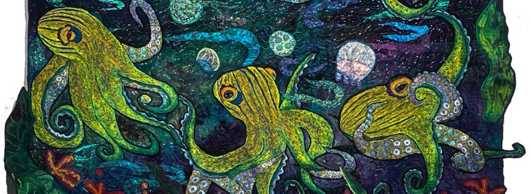
Designing Ways: East Meets West

972 Shelter from the Storm

This is another modified blog from almost ten years ago. It’s still an interesting story. And an interesting way to think about how we design our art.

It’ss almost impossible to talk about our art without talking about the art that comes before us. Before we talk about design, it’s worth saying that there are many different design aesthetics. It’s not that a design is good or bad necessarily. It’s designed to be part of the statement. The notions that fuel our art choices are a statement loud and clear past subject matter and past our technical handling of fabric and thread.

As quilters, a lot of us have backed into art by accident. We started with squares and one day found ourselves with an odd quilt that somehow was an art quilt. Maybe it had too much orange in it or you found yourself like me, embroidering frogs and bugs into the borders. There’s a tender soft spot in most quilter’s artistic persona. The part that said that you should have gone to art school or studied water color. So our first designs spring out of a personal view. Later, as we become more facile, we realize that the choices in design are a huge statement all their own.

My first artistic love was the impressionists. I grew up near Chicago, and there was a pilgrimage every year to the Art Institute. I strolled through the halls looking for paintings like old friends. Since they were my first real introduction to art, they felt bland to me. Safe. Something soft and soothing out of my childhood.You know it’s become mainstream when you see it on a birthday cake. This astonishing cake is by Megpi, a pastry chef in Silver Lake. California. You can see her work if you follow the link to Flickr. 

impressionist cake by megpi

impressionist cake, a photo by megpi on Flickr Since you can buy Van Gogh’s work on umbrellas and coffee cups, it’s easy to miss the point that he was a raving revolutionary in his time. His work nauseated the current critics, got him hospitalized, was refused for all the important salon shows, and the subject of ridicule in the press. Time and familiarity have made him a lionized artist, but that was not who he was when he began.

I was immediately in love when I discovered Japanese prints. It was a while before I realized why. The Impressionists took much of their new artistic vision from the prints out of Japan. The first prints that came out of Japan hugely influenced them as beginning artists.

In contrast, this is a painting  called Nocturne from around 1825 by Turner. Turner would have represented the design aesthetics from the early 19th century, that Van Gogh and the other impressionists and Post Expressionists blew out of the water.

Early 19th Century Western art was about permanence. It honored stability. It was a world of people in their proper places, forever and ever. It used Greek and Roman scenes  and portraits of nobility as an way of saying we had an eternal understanding of a changeless world.


Japanese art was about the moment. It moved. It created a path for the eye to follow. It went off the page. The impressionists saw it, fell in love with the concept and incorporated it into the designing of their art. The movement is called Japanisme. It was in my humble opinion, the beginning of modern art. And changed us all.


Myself, I cherish movement. I plot my quilts to travel from one side to another, taking the eye on a journey across the surface. The visual path and vertical path quilts I’ve been exploring are all about the traveling eye.

The decisions behind design are the most telling. Without a word they say so much about what we create, what we find important, and what we value. The way we structure our art is at least half the story we have to tell.

971 Waterlily Pond

The Lunatic Fringe: Where Do You Get Your Courage?

972 Shelter from the Storm detail 3

This is a reblog from around ten years ago, but I still think it holds true. How do we gather the courage to do art? And the courage to show it and let it into our lives like a strange wild cat? T

I’ve been teaching now for almost 30 years, so it’s not uncommon to find people who’d had class with me teaching, writing, creating amazing art and winning awards. Students in the quilt world are not like students in other places. They’re often experts in their own right. They’re there in class to pick your brain, but they’ve already got amazing skills. So it’s not like that student owes you very much. They’re another traveler, perhaps out ahead, perhaps a step or two behind. But you’ve showed them a cool trick or two and they may well have showed you as well. It’s more like meeting a pilgrim on a similar path.

I used to give everyone three scraps of fabric: A red badge of courage, a green lunatic fringe and a purple heart, because if you’re doing brave things, of course they’re shooting at you. At some point, in the four thousand things that have to get done before class, I stopped. 

I also always used to wear a badge. At one point someone gave me the most wonderful bug pin. I put it on my badge and it was part of it. At another point, I lost it. No one seemed to miss it.
My old student asked me if I was still giving badges. I think I had him in class 15 years ago.
It still mattered to him.

Every so often, someone would stop me and tell me they lost their badge. I gave them explicit permission to make another for yourself or for someone else. 

Perhaps the badges need to come back. Am I as brave as I need to be? Are my students? Are any of us?

The wizard of oz behind the curtain

A sacrament is an outside sign of an inward grace. A symbol can be one too. Can an ordinary person can stand behind a curtain, make a great deal of noise and convince people to be brave and have a heart simply by giving them one? Yes, perhaps. Symbols do work

Should I start making badges again?
Do we need the lunatic fringe rampant?
Would you stand in the lunatic fringe?

10 years later, I’m no longer teaching. But I am struggling for my own courage, my own celebration of my wounds, and my understanding that of course I’m out in the fringe. I ask you how you hold your courage to create? What badge, pledge or thought holds you straight and strong at your art? And if I made you a badge at some time, would you let me know if it worked?

Laughter for Drama Queens

For fun I was looking at some old posts of mine. I found this fun and wanted to share it with you.

I am a redirected Drama Queen, Daughter of a Drama Queen Delux. My mother was not a happy girl until she had a drama 10 feet high and too wide to get through the door. It was all about telling stories.

Now Margaret Eddy was the queen of all stories. And a serious fan of silly. She told amazing whoppers, one-liners, true tales spun into gold from straw, hopeless lies and astonishing steaming piles. She loved her drama. She had a somewhat loose relationship to truth. She was a devastating school teacher, because much of that could indeed come out in a teacher conference meeting or a family reunion. But she had a special gift for looking within and without. First she’s build you a verbal image of herself as she felt about the story. But then she’d draw you into an outer view, where you could see her spinning in what she knew was a silly situation, build for howling laughter.

It happens to me in my quilts. I’m quilting along and I realize that this silly thing I’ve drafted is someone I know. Or worse, me. There with all my rather small fears and desires. I’m not overly deep. I’m just noisy. At that point, it seems just to the point to let it be silly. I am. It is. And the world is better for it.

This quilt, The Orchid Olympics, wasn’t meant to be funny. It just happened. I’d found a great picture of a frog in an odd pose and worked with it. One afternoon in a class demo, I was placing it into the piece and trying to put a sun over his head. It wouldn’t go. It just wouldn’t go. Not over. Not to the side. 

I looked again at the frog and thought, “If you get into that pose, it has to be for something like the Olympics. No one would willingly bend like that otherwise.” The sun fell into her hand like an award and there we were.

Mirror, mirror on the wall, I am my mother after all. But I try never to tell a story on myself until I’ve found the funny part. Perhaps it helps to be short, round and have a pug nose. My gray hair also seems to give me an amnesty for silliness. And why not? 

Eye Popping Color: Charting Color in Fantasy Mushrooms

I’ve written a lot about color because I think a lot about color. I It fascinates me, from dye, to fabric to thread. I’ve been working on a batch of mushrooms for some new quilts and I decided to look at the colors through the color wheel just to codify what I was choosing.’

I’m not going to talk about color theory here, precisely. Instead I’m going to talk about relationships in color. Color theory can be deeply and obscurely discussed in millions of ways. I’ve seen it discussed as building blocks, tonal poems, wave lengths and light waves. I’m not sure how much of that is useful. I thought it might be helpful to simplify instead. I’m not dissing color theory. But I am trying to think about it differently.

I’m also not going to use color names. I want you to look at the relationships of the colors instead. But here’s the distinction I find most helpful. Color harmony has to do with how close colors are on the wheel. Contrast has to do with how far away they are. Harmony is of course beautiful. But contrast is what draws our eyes, It is what makes colors pop.

Contrasts come in several style. The colors themselves are their positions on the wheel. Darkened and lightened colors make the tones and tints. Then there is the clear colors. So for fun, sit back, get drunk on the colors and ignore the names. But look where the contrasts and the harmonies are in these color choices.

Notice the range of purples together that create a smooth section of colors and the yellow and greens that contrast. Notice the differences between the dark blues and purples and the lighter yellow and greens. The further distance colors are from each other, the stronger the contrast. The contrast creates the pop.

It’s not as simple as a recipe. It’s not what I was doing. But I did pick full swaths of colors next to each other with a few colors opposite from them. I also actively chose light/dark ranges for harmony and for contrast. It’s not about what we name colors. It’s about their relationship together. The very light green makes the sparkle on this ‘sroom. It looks white. But the green heightens the contrast.

Shading looks different than colors put side by side, but they still meld into each other. The eye blends thread colors that are sitting side by side.

Where are they going? They’re not in place yet, and I’m hoping for smaller frogs to go with, but bright kick ass mushrooms are exactly what I had in mind. I think I’m going to make it rain.

In process forest floor with mushrooms

I’m going to leave you with a small gift here. There are two color wheels here that I made for this blog, one empty and one fully colored. I invite you to use them to chart your own color on a project as you work. Down load them, print them up and use them to see how the colors you use chart up and relate to each other. And let me know what you find. It can be eye opening.

You are welcome to download these two pictures to chart your own colors!

The Light of the World: Creating a Fabric Universe

The blue fabric creates the light that shades these flowers with blue, and pale green as well as white

You would think that the light in a quilt begins with the color choices of either thread or fabric. It does, and it doesn’t.

The red/fuchsia/ soft orange shades this white mantis with bits of pink and yellow as well as white.

It comes back to hand dyed fabric. I dye fabric because it creates a world of it’s own. The color of the fabric creates the light of that world.

I’ve been working with an idea of frogs on a false bird of paradise vine. I wanted a daylight background that would bespeak greenery without being strictly green. So I started looking for a piece that create that world.

I did not dye fabric for this specifically. This is what I had in house.

So which will I choose? I pulled out the purple first thinking it would give more contrast. But it was absolutely glum. The blue looked like a good choice but it was in itself too watery and not long enough. I didn’t mean to pull up the piece with the lavenders and greens, but I love what it does with the purple stitching in the frogs.

And look what it does with the red/yellow fabric for the vines. The fabric makes the light of the world I’m building.

Had I dyed fabric for it, I might not have been as pleased. When I do, I dye at least three-five pieces in a range to get one I like. Hopefully.

But all those purples, greens and yellows can’t be too wrong.

I’ll show you more of this piece as it goes along.

Fitting In: The Impossible Dream

Starry Knight

Being an artist is like being the odd kid in an ordinary classroom. It’s not like you aren’t trying or you didn’t have good ideas. It’s that you put a purple gardenia in your hair and are wearing different unmatched socks to boot. It’s more like you’ve scared your teacher and everyone else, just by doing what comes naturally.

It’s the questions artists ask. It’s the things we have to do. It’s the things we are compelled to do while we figure things out.

One of the hardest things for me is to follow other people’s proscriptions and prescriptions. You would like me to make a what? I should be quilting dogs and cats? It needs to be a particular size? Or shape?

That’s how I ended up making this huge ass dragonfly quilt. I was asked, by the Indiana State Museum to make a star quilt of a particular size. I tried. Bless me, I tried. I pieced up samples, played with star imagery. Did not work. Finally I ended up giving them a star. He really is a star, but you could see from their faces that they weren’t expecting anything like that. They weren’t unhappy, but it was clearly the arrival of the Spanish Inquisition. It did end up printed in the newspaper, just for oddness, I believe.

Lately I haven’t been able to leave alone these elongated shapes. I Need to fill the shapes and make them dance across the surface. I’ve called them visual paths, because it’s a matter of making the eye travel across the surface of the quilt.

So people want these quilts? Historically, they have. They fill a huge space with a little foot print. Which is always useful. And a neat trick.

Can you put them in a show? Probably not. I tried to put two of them in a project for some folk lately only to have them rejected. They were good quilts. But they were an aggressively odd shape.

Can I make myself fit expectations? Sometimes. On a good day. If I wear my looser big girl panties and stick my tongue out when the going gets tough.

Swoopdive 2

The truth is, I simply have to, to some extent, work on my own obsessions. If I walk too far away from what compels me, I have to fight too hard to do what I do. It’s a good exercise to push against it. But it grinds the art out of me. If we only fit in minimally around the edges, perhaps we fill in the spaces only we can fill.

In Honor of UFO’s

What I planned

Do you finish everything you start? Star in your crown! Good for you! If it works for you I have no arguments to offer you against your virtue and your tenacity. But for those of us who don’t, I get you. I’m one of you. And I refuse to blame or shame anyone, especially myself about having things that just didn’t get finished.

What happened

I sold two fish this week. Just the fish. The lady getting them is thrilled. She wants to use them in her own work. I trust her not to use them for anything commercial. I find myself a bit lost. I had plans for them. I’d kept the drawings for around 6 years. I found them again, and embroidered them. Somehow I thought my plan for them would work out. Not meant to be. They’re now on to another person, another journey that they, as little fish get to take.

It’s not the first time I haven’t finished a quilt. There are some I will never finish. Some were purchased or given unfinished. Some that people have stolen from me. Some that got lost in odd ways. Some that I didn’t have the right technique for yet. Some that just went wrong.

These quilts were all my teachers. They gave me good information, good help, good company. Some just didn’t need to be finished. I’d learned enough. Sometimes someone else needed them for all kinds of reasons. Sometimes they disappeared into the clutter, never to be found again.

My goal is not completion. I’m not a human doing. I am in the process, the continual process of learning my art. My finished quilts are not product, really. They’re a byproduct of learning.

To finish or not to finish?

Do you need it for a show, a space or for a client or yourself?

Do you feel a need for it?

Are you getting learning or enjoyment out of it?

Is it tech you don’t want to explore anymore?

Does it have problems that you can’t fix?

Does it make you feel unhappy/unconfortable, crushingly bored or bad?

Life is short and time is not ever as long as we would like. Ideas are everywhere. and they don’t always stay fresh. New ideas need to be embraced. Petted, fetted, watered, trimmed and sometimes finished. Sometimes not. Sometimes let go of an idea that isn’t working the way you want is better than letting the finishing grind you to a halt.

I challenge you to use your studio/art time to do things that teach you, uplift you, train you, entertain you and help you grow. Finishing everything doesn’t do that for me. What does is the flexibility to follow my art where it needs to go.

Nothing Exceeds Like Excess

Nothing Exceeds Like Excess

962-21 Queen Bee

I’m not the sort of person who does things half way. I’m just not built that way. So when I did a little experiment with some oil stick rubbed fabric, it sort of got out of hand. I had a handful of some smallish scraps and tried some straight stitching with 40 weight metallic in a manner I hadn’t used for a while. I spent about a week on it and found myself with a good dozen little quilts.

They were also experimental in the sense that they’re smaller than I usually work. Tiny. We’ve talked about working in different sizes. Size is actually about your art filling the space where it lives. Intricate small art fills small places. Large art tends to lose the intimacy of tiny work.

Small work fills in differently. Attaches to the eye differently. But there is another nice thing about small work. It can sell for a lot less money.

Which is a good idea right now. Remember that thing about me not being able to do things half way? Two weeks ago, I found an old Elna Supermatic green sewing machine.

Actually I found 2. One perhaps for parts. I’m a Bernina girl from way back. I love the stitches on the Bernina. But the old Elna has a different bobbin mechanism that’s set up to adjust for thick thread.

Remember that large pile of #10 pearl cotton I dyed up? That kind of thick thread. Don needs to do some repair on them, but I can’t wait.

Which is how I find myself needing to catch up after having bought two older sewing machines out of budget. So the new quilts are going on sale, to help me catch up.

I’ll have all my work at my Etsy Shop on sale for 20 percent off for a month. If you’ve wanted a quilt, this might be your moment. And there’s new experimental stuff I think you’ll enjoy seeing. Do let me know what you think. It’s not like I can really do anything by half.

What Makes You Clean Your Studio?

It’s not a natural thing for me. I clean. Once every twenty years, if necessary. There’s something to be said for that. You don’t want to rmess up a functioning system. Right.

I used to perform a service for people with unsupportive life mates who did not understand creative clutter. I would take them through my studio, through the thread wads, archeological book dig, archeological project dig, past the dye puddles do the archeological dirty dish dig. People would run out the back door of my one bedroom screaming that their mate could do anything, have anything, if they didn’t let it get that bad. I’m not quite there yet. I’ll offer the service again when everything silts up.

Forward to this morning. I couldn’t find my clip on magnifiers anywhere. Not anywhere. And there is no way for me to thread monofilament nylon without them. After two hours of breaking thread and taking twenty minutes to thread the machine each time I looked over the 9 pieces that needed monofilament nylon and decided I could either go home or sulk properly in a corner. I ended up emptying 9 drawers of polyester thread looking for Bottom Line. And sorting my whole polyester thread collection.

How do I sort thread? By content, by size, by purpose and by color. I’ve learned that if I pull out 10 spools of thread for a piece, unless I’m careful, they go into a basket that gets dumped into a drawer somewhere where none of it’s friends live. Finding them after that is an exercise in chance. All at cleaning up doesn’t sort anything.

All the #40 weight polys, the #30 weigh metallics, the #8 weight metallics, the #5 and #10 pearl cottons have a section of their own. And then I sort them by colors. So I can pick up a bag of thread and have all of that color at my fingertips. Until that messes up.

Bottom line, I don’t clean until I can’t find what I need. I’m also missing a bag of moths. I’ll either clean and sort until I find them or make more. Whichever comes first.

Nine drawers later, not yet, I will have sorted out all the poly embroidery thread. It wouldn’t have happened at all if my glasses hadn’t disappeared.