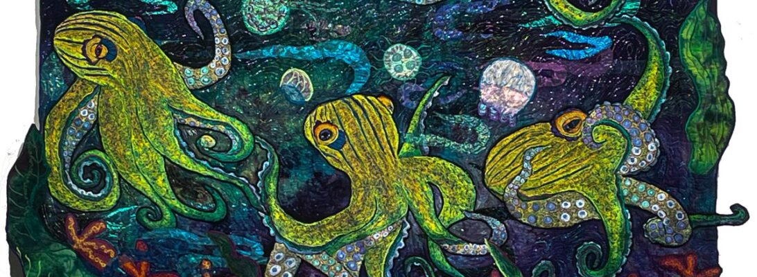
The Fourth Pin-Up Girl

If you’ve been following my posts, you’ll know I’ve been on a quest to clarify my process. It started with my process photos. I found I’m quite rigid with how I create work. It always feels like play. But the structure has to be the same, because the steps build on each other.

Pin-ups are a dress rehearsal. Mostly I use component quilting as my work model. I start each quilt with a central image. Then I add embroidered components around that image until it makes sense. At some point, I have a pile of embroidered bits and the background. That’s when I do a pin-up.

Why four? That isn’t rigid. As the pieces develop, you need a dress rehearsal to figure out how they work together. Whenever I’m not sure of the next step, I do a pin-up. Some pieces, I can pin them up and I know. Some take endless pin-up sessions. I place my components into the quilt on my design wall and stare at them for a while.

This one has taken four pin-ups so far.

What have I learned?

  • The octopus must be on an angle to work.
  • Yellow fish are too bright. The orange fish work better.
  • This is a dramatic background but it really doesn’t have a light source. I could build one but it’s busy enough already.
  • Too pink tentacles are too much.

Angle better than straight

Orange fish better than yellow

Overwhelming pink tentacles.

I wouldn’t know if I hadn’t tried it all in the pin-up.

I also fixed the tentacles so they’re better in place.

My best studio tool is the design wall. My most important process is to pin things up and really look. Because if I get it wrong and I stitch it down, I have the choice of it never being right or ripping for days.

Color by Contrast and Cast: Adjusting Your Tone

Whenever I work in beiges, I get in trouble. Perhaps I’m not in well enough with St. Kim the almost-virgin martyr, who is the patron saint of beige. It’s off my map. Perhaps I should light a candle.

When we think of color, we think of hues. Red, blue, green, yellow.

But color is so much more complicated than that. Which is the frustration of kindergarten crayons in a box. Too simple to be of much use. Hue alone is only a starting point.

Color is defined by many factors. What matters sometimes is not the hue, the raw color itself, but the contrast between the other factors. Extreme contrast sparks our interest and makes the definitions clear.

There’s a quilters’ tradition for this. Log cabins and shade and shadow quilts have always been built on a dark side and a light side. You separate your fabric, not by color, but by value, how dark and how light the fabric is. This quilt is divided dark and light, but the cast of the colors is a soft beige. It’s defined by what they left out as much as what they included.

This trick works for a million and one quilt designs. But all color is color. It works in thread work as well.

I’ve been working on the next octopus, which is striped in black and white. I could have done that. But it’s dull past hope. Shading black and white is a great exercise, but I didn’t want it for this piece.

Here’s where I got myself into trouble. Those somewhat pink tentacles are a bit disconnected from the sand-and-gravel colors of the octopus’s outside. Pretty but wrong.

The background surprised me too. I had been looking at some murky colors. But when I put up this piece, it was it. I didn’t even pin up something else. But it was loud.

I quieted it with some soft elemental seashells in neutrals. Pretty, but not enough.

I dulled down the yellow fish. I stitched several colors of purple over them to give them some depth and to dull them. Again, not enough.

I made some fish to match the under tentacles.

Of course, I missed the idea of changing the octopus. I gilded the octopus. This odd green-gold thread has become a favorite shader lately. It shifts the tone of the piece. Big change.

Anytime you go off your map with a piece, you’re in for an adventure.

I have high hopes for this piece, but it’s taken a bit of maneuvering to get there. We’ll see how the pieces go together.

Hummingbird Commission 4: The Background and the Applique

You would think that the background doesn’t have that much impact on a quilt. Something pretty to showcase your basic image, right?

Not my experience. The background sets several things in place. It sets the time of an image. And each background tells a different story. The images tell you the who and what. The background tells you how, why and where.

Here are the backgrounds we chose preliminarily for this piece.

They’re all good choices. They tell a different story. Is it daytime or night? Is the flower alone, or is it in a garden? Size tells you different things as well. Smaller pieces are more intimate and look more intricate.

Since this is a commission, it’s the owner’s choice. She wanted the soft background with lots of flowers.

I love these oil paint stick rubbings! I usually overstitch them to accentuate the texture. I did that here as well

Lately , with paint stick backgrounds, I’ve been stitching the whole background, rather than applying my image and stitching the background around it. It makes a smoother piece, and it blends in better.

These are stitched from the top with polyester Neon Madeira. Since I’m following the rubbing, I need to have it on top where I can see it.

Buto it’s still worth looking at it from the back. You can see the unstitched part that will be covered by the flower.

Here’s where the flower fits in. I edged the flower with an angled zigzag stitch, echoing the colors I used in the petals.

For the hummingbird, I wanted him to pop. So he got outlined in black. It sounds unoriginal, but black always has more impact and leads to a more defined edge.

We’re ready to back and bind here. Thanks for taking this journey through this quilt with me!

Am I Biased? Making an Angular Border

In working on the Octopus Roclets. I’ve felt a need for angles. They just do’t stay still. And the easiest way to make something feel like it’s in movement is for it to be at an angle.

Which angle? They do read differently. I want to try an isosceles triangle, made from an elongated rectangular strip. I think it will add to the movement of the piece.

Angles mean bias. We talk about fabric being on the straight of grain. If you tore a strip off the fabric, that strip is the straight of grain. That’s a fairly stable piece of fabric. It will stretch very mildly across the width and not at all in the length.

Here’s the definitions of bias from ai on Google.

Fabric bias is any diagonal direction across a woven fabric, while the “true bias” sits at a precise 45-degree angle to the lengthwise and crosswise threads. Cutting or binding on the bias gives the fabric natural elasticity and a fluid, body-hugging drape. [1, 2, 3]

Understanding Bias

True Bias: The diagonal 45° cut between the two; this is where the fabric is most stretchy and flexible. [1, 2, 3, 4]

Lengthwise Grain: Runs parallel to the finished edge (selvage) and has almost no stretch.

Crosswise Grain: Runs perpendicular to the selvage and has slight give.

If we cut our borders across at an angle, that edge will stretch because it’s bias. We really don’t want that. Bias stretches out and makes for wavey borders and seams.

Controlling Bias

Accurate cutting will help. I need to square up my center and use my rotary cutter to make clean edges. But the secret weapon is starch.

Starching your fabric makes it stitch better. And it makes it stretch less.

Here’s the mock up I did to try this out.

Making angled borders

I used:

A center rectangle or square.
A strip of fabric twice the size of your border and a bit longer than your center piece

Liquid spray starch,I’m using Linet Starch.


Tools:
Rotary cutter, ruler and mat
Sewing machine with straight stitch and quarter-inch foot
Iron or rolling seam presser

I starched the two fabrics with a solution of 1-1 starch and water

I cut the yellow strip in half and then cut the strips fro corner to corner diagnally.

For more information about starch, see Getting Fabric Straight.

I pressed my seams with a rolling seam presser

I trimmed my edges square to make

a slightly angled background.

I’ve added shell and rock rubbings to the bottom

Here’s where we think the octopuses will go.

I’m still deciding about that. But I’m happy I tilted the background. It creates the motion I wanted.

More Pop Octs: Dancing with Design

This has been a rough week of a lot of medical appointments. Nothing bad. Just exhausting and demoralizing.

I’ve stitched the rocket octopuses. I started with a background that reminded me of confetti yarn, bright bits of color on a soft background. So my octs had to be bright where the background was softer. I’m thinking of calling them the Octettes.

But now we’re at the fun point. We get to create the design.

This is the first pin-up. I do several pin-ups with each piece. The first pin-up is just the background and the creatures. With that pin-up, I’ll know my colors, my path and where the creatures interact with each other and the viewer.

The second pin-up is after I add the elemental bits. Usually these are sheer unless they’re rocks. Water, rock, air currents, sunlight. It’s also where I add small elements that help establish my visual path. I’m thinking gold and orange fish.

The third pin-up is my final design. After I do the third pin-up, I’m ready to stitch. And my options are in stone.

So now I can try it all out. Different backgrounds, different octs.

If it’s just one or two possibilities, I pin it up and shoot photos. Here I had a bunch of choices so I photoed the elements and put them into photoshop. It’s a cheap thrill, but it’s much less aerobic.

Here are the ones I like best. I really like the ones swimming in opposite directions. The ones weaving tentacles work best on the larger pieces of fabric. I’m still not sure.

I’ve done this before in a blog called Pin Up Girls: Family Planning for Octopuses. There I was trying out a number of different quilts. This is just one. But it is a good way of looking at options, without having to pin everything up physically.

What do you think?

Popping Up: The Pop Art Element

I’m not a very abstract person. I’m not good at reducing forms or working without a visual reference. Of course, I’m not always wedded to reality either. I believe that when we stray from a photographic reality, who we are, what we mean, and what we see have a way of coming out to say, “Hi!” And a lot of other chatter as well.

For a long time, reality was the task of art. Up through the Renaissance to modern art, we’ve lauded the ability to make something that looks real. I find that wearing as an artist. If you want complete realism, you probably want photography. You’ll see your image just as it is. Once we had photography, realism stopped being a goal and became something accomplished.

Photography works for the surface. It fails me for movement, for mood, for expansion off the canvas, and for the feeling it gives me. I have nothing against photography. But it usually leaves me a little cold.

So once we left realism as the only goal, there was room for all kinds of experimentation.

One of the experiments was Pop Art. There were many versions of this. One was to repeat an image in rows or patterns in bright colors. This is Andy Warhol.

Andy Warhol, Converse Tennis Shoes

I’m not interested in tennis shoes, but I do want to see what happens if I put repetitious octopuses in bright colors together. This is the first octopus. The plan is to put four together. I’m not sure if I’ll use rows or weave their tentacles together.

The colors on the octopuses echo the hand-dyed fabric I’m using. They have a light source that shifts the colors through the tentacles.

Here are three more in different states of completion. When we’re done, we’ll see what pops up.

Lace Jellyfish, Step by Step

I wanted three-dimensional transparent jellyfish with opaque areas.

This technique depends on the stabilizers. But there are a number of different stabilizers that will work. They are made for very special purposes.

Stabilizer Sandwich

This time I made my stitching sandwiches out of a layer of Totally Stable for my drawing, Paper Solvy, lace or organza, and Badgemaster, All the stabilizers except the Totally Stable will dissolve out of the work. What I want when I’m done is a clean outline and edge, with some white areas and some transparent.

You can make an image just with your stitching. But you have to make sure all of the stitching connects with itsself or it will fall apart when the stabilizers are gone. Instead, I used commercial nylon lace and organza as the fabric

What do those stabilizers do?

  • Totally Stable: Iron-on, tear-away. Good surface for drawing a pattern
  • Paper Solvy: Paper-like, tearaway that provides stabilization without a hoop that will dissolve in water.
  • Badgemaster: Heavy-duty corn starch topping that dissolves in water.

The order of the sandwich was, from top to botton, Badgemaster, organza or lace, Paper Solvy, and Totally Stable. Snce we’re working upside down, Totally Stable drawing layer is on top where we can see it.

The threads I chose were a polyester white top thread and a Cristalyn white metallic in the bobbin. The metallic is more fragile, and that is why I have it in the bobbin. I chose white because the background is so dark, and I wanted them to shine out. All of the stitching is done from the back.

You’ll notice that I used 2 different magic markers for my drawings. That was an error. Even with all the stitching, the marker colors showed through. I don’t mind either the blue or the orange, but they don’t work together in the same piece.

The Stitching

These are all stitched free motion from the back.

Stitch Process

Outline the image. Freemotion zigzag.

Remove any of the Totally Stable parts you want to be see-through. Score them with a pin and pull them out.X

Use a straight stitch to texture the jelly.

Remove the excess Paper Solvy and Totally Stable from around the pieces.

Stitch around the edge with a zigzag to stabilize them.

Cut away all the excess stabilizer

I edge-stitch again just to give them a more solid edge.

The Paper Solvy and the Badgmaster need to be dissolved in hot water.

Badgemaster is starch. So I took the trimmed off scraps,dissolved them in water, and dipped the jellies to give them that hard starched edge. I dried them on freezer paper. Notice that the orange jelly is the one that was drawn in orange. I need to rethink my mmarkers.

We’re ready to roll with the 3rd pin up on Octopus 5. I believe we’ll call it, Rock, Paper, Shark.

The Big Black Line: More than Just an Outline

Every image has to be attached to a quilt at some point. There’s more than one way to accomplish that. But the one I use most is a solid black line of polyester zigzag embroidery.

That sounds dull, doesn’t it?

The black poly outline does more than you would suppose. It creates a crisp outline.

I’ve tried using other colors. Bright, light, neon colors. Nothing gives the same punch as black.

It’s not true of flowers. I can use a bright color outline on a flower that pops it perfectly.

The outline defines the edge visually. If you want it to show up across the room, you’d better make it bold. The outline is the finish line.

I’m just finishing outline octopus 4. One nurse shark is outlined. One is not.

But it does two more things. It makes the image puff just a little. I like the 3-D effect.

And it holds images down solidly. These embroideries wave around the edges like the flag on a windy day. A light line of stitching does not hold them down well enough.

I did not need to cut either the sharks or the octopuses, to get them to lie flat for this quilt. All of it was done with a heavy black outline. The thread traps the edges and mashes it into place.

I used to use black metallic thread to outline metallic images. But since that has to be done with metallic thread in the top, it’s an all-day sucker. Takes forever. Endless breakage. The polyester thread doesn’t have the same shine. But I only have so much hair I can pull out in one afternoon of sewing.

Doing the Twist: Designing Ways

I’m always astonished at how much an image can change with positioning. One of the advantages of component quilting is that it can be moved endlessly to get the placement right. I went to embroidering large images some while back. But I’ve learned several other things component quilting allows me to do, and I use it constantly now.

Changing Processes

Three changes in my process made this work: component quilting, pin-ups, and daily process photos. I work with components rather than images stitched into the work. I do multiple pin-ups for placement, and daily process photos that let me track the changes.

These are all relatively new for me. But it wasn’t something I planned. I just happened to find these processes helpful, and now do them regularly just in my studio work.

Component Batch Quilting

Batching a number of elements at once allows freedom later on in the project. Instead of just doing the larger images, almost all of the embroidery is on a separate sandwich, ready to cut out and use.

  • I’m free to change my mind about each element. If I embroider a moth in the piece, that’s where it stays. Right or wrong, it’s not going anywhere. You live with your choice. If the moth is separate, I can move it indefinitely.
  • I can make images from the same color choices that are in the same range but unique.
  • I can always use whatever is left over. There are never enough fish, frogs, bugs or birds.

So now, almost all my embroideries are made as components that can be used at will. For more information on batch quilting, check out Streamline Quilting with Component Techniques.

Pin-Ups

The first pin-up is where I design my quilt. Once I put the quilt top on a sandwich, I put my main images in, see where they might fit, to rearrange things.

But the first pin-up is only a beginning. In this case, I did my pin up, added my elementals, and pinned it back up with those included. My original intent was to have the octopus learing over the top kind of like Cthulu. But it was flat.

So I gave it a twist. To make something move, put it on the angle. I angled the octopus, to put him into motion. Then I angled the other elements to echo that motion.

Picture This. by Molly Bang, is the best book about composition. It’s about how people process imagery. First, she illustrates Red Riding Hood with rectangles and triangles. And she made it work.

But she explains how we see things, what meaning we take from images.

If you are an artist, run out and buy this book. Then buy another 5 copies, because you’ll want to give it to every artist you know.

She has some very useful observations. Horizontal lines are stable. Vertical lines are stable. Angled lines look like they’re falling. If they’re falling, they’re in motion.

I angled the octopus to echo the left jellyfish.

Then I angled the nurse sharks to echo the octopus.

Daily photography

Having daily process shots gives me so much information about what is and isn’t working in a piece.

Including a black and white picture to evaluate values.

I’m always surprised at how much a little twist can do.