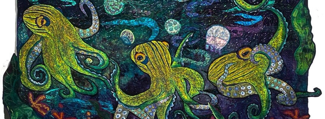
Octopuses have put me in the land of the garnet stitch. It creates. textire and pattern, all within it’self.
Garnet stitch is one of the great non-programmed stitches. it’s simply moving your hands free motion in circles. Check out the Variable Garnet Stitch for more information about the stitch.
Garnet stitch has another very useful feature. You can always see the background behind it. Sometimes that is to be avoided. I pick my embroidery background to match the overall background carefully, so only the stitching stands out.
But sometimes I want the embroidery background to shine through.
This was one of those times. The background for this piece is darker and moodier than the other pieces in the series. I needed something to lighten it up. So I used a very odd cream and green background. I love it. I have a green and cream light octopus in a dark sea.
We are on to the pin up stage for octopus 4. That’s always the moment of truth. You know if it’s going to work at that point.
Because I’ve made small metallic fish and 2 nurse sharks, I have my components to fill the space and set a path. I’ll tweek it some, but the design is pretty much there.
There’s a lot of stitching left, and I need to do my water layer. But I’m confident I’m going to like this piece.
Just to show you where I am in the octopuses garden, here’s the pieces so far.
One more at least to go. Does it look like a show yet?
I love solid zigzag embroidery. It allows me to detail, shade, and shape an image as effectively as if I were painting, with the difference that I won’t have my media spill on me.
But zigzag embroidery, by its nature, does not always lie flat, The stitches pull together and it shrinks, but not in a regular or even way. Eventually, you are looking at an embroidery that won’t flatten.
Can you avoid it? There are things you can do.
Use stabilizer. I use Totally Stable, Decor Bond, felt, and Stitch and Tear, sometimes within the same piece.
Use a smaller stitch width
Embroider on a separate piece of cotton and stabilizers. Then cut the piece out.
Will that fix it?
Wouldn’t that be nice? No. All you can do is reduce the ruffling. So there comes a point where you are looking at a very unflat embroidery, ready to go on a flat quilt top. Desperate times call for desperate measures.
The outline accomplishes several tasks. It covers the edge. It cleans up the line. But it also gathers in and flattens the embroidery. And outlines of stitched areas make those areas puff just a bit. A lot of things lie flat after the outlining.
Except for the things that don’t. Surgery, along the design lines, is the final answer. Can I stitch over the two embroidered bits. Yes! Will you break needles at that point? Oh, yes. I plan to break 5 needles a day, outlining. I don’t always. But I have the needles in hand in case.
Are you screaming that I cut my quilt? I did. May I explain something? I sewed it. I cut it. I sewed it again. How is that different from any other kind of quilting? Fabric only bleeds in the wash. The rules only apply if I embrace them. And I won’t do that if the rules don’t give me what I want.
Is it worth it? Flat is a quilter’s concept. A bed quilt should lie flat. So we think an art quilt should, too. I’m not sure about that, but they do judge your work by it and it does look bad on the wall
I may have to cut in the surface to finally flatten this piece. We do what we got do.
I never used to think about how a quilt would be viewed. Was it pretty? Did it move? Did it tell a story? Did it change people to see it? I never thought about how the size of the space around it affects what the viewer sees.
Now I’m keenly aware of the space a quilt will hang in. I don’t have any control over that when I sell a quilt. It goes where the owner wishes. It becomes part of their house and their lives.
But small work is viewed differently, just by definition. Small work is made to be examined. You come up close to see it. Every detail matters and is exposed.
Unfortunately, most small work isn’t really that visible at a distance. It’s made to be intimate. Your relationship with it is within its small space. It fills a tiny space with an explosion of color and detail.
Larger works have a harder task. Done well, they will pull you from across the room. The movement and the color should sweep you in. But once you’re up close, the detail should amaze you.
When I first started using rubbed fabric in pieces, they were all experiments. I worked very small, partially to learn and partially to see how they would be received. I was limited by the size of the rubbing plates. The largest were under a square foot.
I’ve worked hard to find alternatives since then. I’ve used ceiling tiles and texturized surfaces. I’ve learned to make my own rubbing plates from modeling paste using stencils. So my options have expanded not only in size but in possibilities.
With these octopus quilts, I’m using the rubbings as objects themselves, rather than backdrops. Mostly, I did seashells and jellyfish.
I love the rubbings I’ve done for this. But they need something to pump them up to be seen across the room.
I usually use straight stitch #40 poly thread to match and shade the rubbings. That’s exquisite on a small piece. It’s almost invisible at a distance. So how do we pump it up?
I chose to stitch my jellyfish in white. I rarely use white. It’s too bossy. But for this piece, white thread pumps the jellyfish up.
I chose to outline with a very small zigzag. It’s a subtle difference. But it does define the line.
For the seashells, I did not outline. Their shapes were visible enough.
The downside of this much stitching is that I have some distortion. We can fix that. Where’s my iron?
Once I find something that works, I tend to stick to it. A creature of habit, like anyone else. What pushes me out of the box? Mistakes! Misorder! An inability to find what I need! Basically, it takes a catastrophe. Fortunately, it doesn’t have to be a big catastrophe for it to do the job.
I really love using rocks in my work. They weigh a piece. They can form a visual line. They add a dark shadow or highlights depending on your color choices that frames the piece. They identify the bottom of a piece.
972 Shelter from the Storm unstitched rocks
I’ve used hand-dye for years for rocks. It already has that mottled texture and color. I used to soft edge the appliqué so the edges weren’t as obvious, but I’ve come to like the shading I can do with black thread. Inner shading works better with a straight stitch. Outside edge works best with a thin zigzag top, and a heavier shaded bottom.
texturized rocks
I sat down and started cutting rocks for the Octopus surround and realized, I didn’t have enough rock fabric. I dye greys and browns specifically for rocks, But there is almost never enough. And greys and browns are regular backing colors I use all the time. But if you’re working on three quilts at once, that’s a lot of rocks.
They also need to be differing colors. Rocks are never all the same. That’s part of their charm. They need to fit well enough to be identified as rocks, but they need a separate individuality to work.
Earlier this year, I ordered a box of cheesecloth. I use dyed cheesecloth for leaves, flowers, and other translucent things. I bought a box of cheesecloth at Joann’s every year or so. That cheesecloth was a uniform open weave,
Now that Joann’s is gone, I found that cheesecloth is graded in sizes by the number of threads per inch. Makes sense. It’s how we class thread and fabric.
I overestimated and ended up with a much tighter weave of cheesecloth. At first, I thought it wasn’t a problem. Then I realized it was much less transparent and much more like regular cotton.
I’d dyed a batch that sat on my table for a long time. It lacked the same transparent grid of the lighter-weight cheesecloth, and didn’t do the texture of leaves as well.
When I went to clear the table, there it was, in about a dozen browns and greys.
So if I use cheesecloth for rocks, what changes? I have to choose a background that will show through. The weave will show through as a grid of sorts, but that can be pulled in different directions and stretched.
Normally, I stitch my rocks on black felt, because it gives me an edge that fits with the stitching. If it’s all backed in felt, it should work.
Interestingly enough, what changes is how the stitching looks. Straight stitching sinks into the texture of the cheesecloth and is less visible. But the cheesecloth makes it more textured.
I’m not sold on cheesecloth for rocks, but I think it works here. I can always stitch heavier.
Over the last couple of months, I’ve been working on a series of fish in the waters. This is an important symbol for me. It explores surviving strange waters, rising out of the depths, swimming with the current, and swimming against the current. It’s about flowing water and changes. It really checks all my boxes. It also serves as a connection with my father, whose religion was bass fishing. Since going fishing made better people than going to church, I respect it deeply, even if I won’t eat fish. I live in water.
So I noodle at the fish-in-the-water image often. If you’ve been following the blog, you know I made one quilt I loved, and I wanted to see whether I could recreate the energy. Not the fish or the river, but the energy of the piece.
Epic fail. I made a very nice other piece with similar hand dye, a fish I drew 5 times before I was pleased, and similar oil paint stick rubbing for the forest in the background. I hated the first fish I embroidered. I stitched a more active catfish, that was better.
Then I took a break and went to find the studio floor. Again. Everything flutters to the floor except the things that go clunk.
There it was, the best background for the embroidered fish I rejected. The fabric made a vortex, so I did too, out of stitching a swirl of sheers.
I didn’t learn anything technical from the exercise. But I did confirm what I already knew. It does me no good to recreate something. Another piece will need different components and approaches. I didn’t need to be making arbitrary rules for myself. I needed to listen to each piece to give it what it needs. If I thought I was in control, that was delusional.
Maybe this is a right-brain, left-brain thing. I’ve been struggling to organize both in the house and the studio. That’s a very left side of the brain thing to do. It’s foreign thinking, but it’s less grim than Swedish Death Cleaning. You know what? No one ever did teach me this. Certainly not my mother.But that shouldn’t stop me. If you don’t know how, you can learn.
So cleaning does turn into art. Eventually.
As Don says, “I’m a man. I can change. If I have to. I guess.”
I can too. If I have to, I guess.
Of course, I hung the quilt up and noticed that the wonderful spiral stitching in the center is unnoticeable 3 feet away. Small flowers and thick thread to the rescue. Of course, the pond has floating flowers.
The change isn’t a technique or a new technology, really. The change is learning to listen better.
A while back I decided to see if I could recreate the energy from a piece I was particularly pleased with. If you’ve been following the blog, I’ve documented it as I’ve worked.
I wouldn’t call it a success. I went through three separate fish, not happy with any of them. I embroidered the best of them and still felt bland.
So I passed on the bass and did a catfish, which I’m not displeased with. The bass went back into the pile.
I can plan all I want. There’s a serendipity to art that is inescapable. While I was scraping out the studio, I found a piece of fabric I’d totally forgotten about.
All of a sudden, my wallflower fish had gone dramatic. I built him a whirlpool/vortex.
My fish fooled me again. I spent some time embroidering some nice metallic minnows that shyly blended right into the background.
They are pretty, but they have no punch.
So I’m trying these brighter gold minnows. I’m still not sure. They’re embroidered from poly, and they might stand out too much. I may need to do some from metallic gold.
Late last year I did a fish quilt that I thought was really successful. As an experiment, I took some of the same elements to see if I could make something that matched it in energy and beauty. Not copying. Just trying for the same feel. It failed. It laughed in my face.
This is not a new thing. I have piles like an archaeologist’s dig of pieces that didn’t work, tucked into the corner or another. And I raid those piles regularly, looking for the next thing.
Here is my failed experiment. I found it tucked in one of those piles. Could it work a different way?
first fish for fish rising
I blame the fish. He’s a nice fish. A little clueless. But not compelling.
New catfish
So we/re trying again. Same background. New fish. Something with more drama going on.
At that point, I abandoned the idea of using the same components. This quilt needs its its own water and world. I put in sun motes across the surface. I decided against small embroidered fish because I already had some wonderful ones rubbed into the fabric in gold.
Fish Rising, with a different fish
Once I added the new fish, I felt more assured. Full disclosure, I cut off the white tail ends since they made it look like Pac-Man. Much improved.
We’re not done yet. Lots of layers of stitching and sheers left to go. But it doesn’t feel like a loser anymore. My experiment was very useful. You really can’t step into the same piece of art twice.
I’ve been working for some time on my octopuses, and I’ve begun to build up backgrounds. I’m working on three of them simultaneously. It’s complicated. But if I work one piece at a time, changes in construction creep in. It’s almost unconscious. I may have worked the water a different way, or the rocks are different, and won’t fit in. This way, I’ll have three pieces that flow into eachother seamlessly.
This week I worked on seashells and jellyfish. I’ve been collecting stencils ( there are no commercial seashell rubbing plates I know of) to make rubbing plates. I used foam board for a base, and modeling paste to make rubbing plates of the stencils. You’ll find full instructions for this in Modeling Paste: All it Needs Is Peppermint Flavor
I used this rock backsplash I got from Lowes to make the pebbles.
This is one of the backgrounds I chose for the octopuses. I’m still not sure about Octopus 1. I’m tending towards the green-blue background. I wanted seashells and pebbles on the sea floor, and jellyfish floating above. I found I couldn’t place them correctly all at once. I put in the shells, then the jellyfish and finally the pebbles.
It’s a work in process. I’m waiting for them to dry to get the next photos and then we’ll add what’s needed. I think today will be cloudy with a chance of fish drawings.
You can blame this on three stinky days when I couldn’t get to the studio due to bad weather and hinky cars. I do not do well in captivity.
Usually, when I’m working on a piece, there’s a moment when I sit with 3-4 backgrounds, deciding which will work best. What I’ve found is that the background tells the story. The image is the who. But the background is the where, what, and when, Here’s a blog that talks about it. Telling the Story: The Background Changes Everything.
So I pin up backgrounds and move images from one to the other until I have the background that either shows up best or explains things better.
With three pieces in a display, that’s overwhelming. My arms aren’t that strong. So I’m going to use Photoshop and the art boards to interview my fabric choices. I don’t need to see the actual placement. I need to see how they go with each other. The octopuses are my pin-up girls and this is a virtual pin-up.
What am I looking for? What do I need my backgrounds to do?
They need to be 45″ tall
They need to match in intensity
They do not need to be blue
They need to flow into each other
They need to show off each octopus well
In the end, just like Highlander and Sudoku, there can be only one chosen for each octopus. There is no way of reproducing hand-dye.
I need to say this was not seamless. Photoshop seems to change every ten minutes, and I was not up to the latest artboard information. But it’s given me a chart to help me decide what works best.
I chose my fabric so I’m looking at 1 yard pieces, 36″x 45″. The edges will be irregular, so they don’t need to be exact.
My third octopus is not completely done and is only partially cut out. I don’t think that will make a big difference.
Here are some of my best choices.
This is a reasonable amount of pin-up. Once I’m back in the studio, I can put up the best choices and turn them in different ways. Strangely enough, the orange went with everything. I’ll put them up on the board and fussy-place them to settle it.
Would I have done this if Don hadn’t called a winter day off? Maybe not. The cats and dogs are way out of the way. That may have involved screaming at the computer. It was not simple. At one point Photoshop locked up and we had to give it the purge. No, I’m not kidding.
But it did give me a way to sort my tops all in one piece.
Why am I fussing? I’m planning on a layer of rubbed sea shells and pebbles on the bottom of each. I’ll get one crack for each to get it right. Testing out my options just seems smart.