A Hummingbird in the Flowers: A Commission

Part 1: The Drawing

I have a commission that I want to share with you.

I don’t do these often because commissions are hard. Commissions demand a lot of communication that sometimes doesn’t work as well as it should. It’s hard to talk about something that is strictly visual.

But this is for a friend. And it’s a small piece. We’ve talked through what she wants. It’s a 7×10-inch ruby-throated hummingbird with a flower. I’m pretty confident it will be what this lady desires.

Because it’s a small piece, I’ve decided to do a series of articles and videos about making it. It covers different skills and processes. For you, it’s a look behind the scene to see how quilts are made. For my owner, she has full documentation. You can all watch step by step how this quilt is created.

She wanted a red-throated hummingbird.

It all starts with a drawing. I draw out sometimes just my subject. Because this is a commission I drew out a number of birds so my owner could choose. These drawings are on Totally Stable, which is an iron on, removable stabilizer that has a good drawing surface. I use it for all my patterns.

This is the bird she chose. I need that bird flying left to right. But because the pattern goes into the back side, the face side will be left to right.

I also need to zone my pattern. She has a green body, grayish wings, and a red throat. Zoning reminds me what threads to use in the top of my machine. Each zone will have several colors within that range that go on the bobbin side. Since we’re upside down, that’s where they’ll show.

What’s next? Stitching in. And figuring out how to make the video program work better. Next week

Thermal Shock: Eye Opening Color

One of the hardest things in embroidery work is to get over the match instinct. After years of perfectly matching thread to my project, I’ve had to learn to pick out the highest contrast threads to make an image that really shows up.

In embroidery, contrast is everything. If it all mushes together color-wise, then you have a very mushy image indeed. Smooth color exchanges that are analogous and sit next to each other on the color wheel are pretty. But they don’t have much punch. So what you want is color that builds not on similarities but on differences. There are several kinds of contrast: color, tone, clarity, and temperature.

Thermal shock is about the temperature of a color. Every color, no matter whether it is a cool or warm color, leans either towards having a cool or warm cast. It doesn’t matter if it’s a cool color or a warm color. There are cool yellows, there are hot blues. If all the colors are either cool or warm they’ll flow into each other like analogous colors. But if they’re not? You get thermal shock. It’s like standing in a cold-water sprinkler on a steaming, hot day. The effect is kind of visually electric.

Blue and Yellow Don’t Make Green is an excellent book explaining thermal variations and how that creates differing colors. It’s set for watercolor, but it applies to all color theory. It’s a worthy book.

So along with the different hues, there are shade and sun versions of primaries. I’ve been playing with them on this phoenix.

I wanted this bird to jump off the surface. I’d decided to outline with in a yellow that leans into the sun to give it some definition. But I wanted it showy. So the colors I picked, cool orange, cool and warm yellows, cool and warm blues left it shimmery and gave it impact.

So here’s another contrast. All that bright sky and bird against misty grey clouds.


For a final contrast, I put small trees up and down the river, to have that clear cool green against all the soft clouds and the fiery bird.

Always look for contrasts. Blending is beautiful, but to give a piece impact with something as small as a line of stitchery, you need heavy contrast, either in hue, value, or temperature. It creates a pathway through your quilt. But it also makes your stitching shine.

I Need Your Help

I’m starting a Patreon Page.

Many of you have probably had classes with me. God bless you for that!  I love my students for their enthusiasm, their creativity, their generosity and their company. We’ve all been on this journey together. I’ve watched us reach for stars, and sometimes catch them too. We grow with our art, by our art,  and through our art.

But time catches up. I don’t really teach at guilds anymore. The travel is too hard. That doesn’t mean I’m not growing through my art. I’m still finding new things to do and new ways to do them. ‘And I always want to share them with you.

There’s another downside to not being able to travel. I’m in danger of losing my studio. Because I’m not teaching on the road, I don’t have a steady source of income.  I understand it. We’re in a tight economy, and there isn’t always money for art.

So it seems we need to find new ways to do that. I do have a blog. I share on Facebook and Instagram, but I want to give you access to more. I want a place where you can get class booklets that are currently unavailable. Or look up a technique and see it demonstrated step by step. I’ll offer small projects that make a big difference in your skill level. I’ll feed you lots and lots of eye candy. I want to welcome you to where I live, in my studio.

If you’re unfamiliar with Patreon, it’s a platform where you can support me and I can share with you. You become my patron in whatever level is comfortable for you. There is a free tier as well. It’s a small and more regular way to keep art going and to be part of that art.

I’m currently working on a book called In The Studio, which is about the process of creating fiber art. Not the cleaned-up version. I want to show the zigzag process of design and creation. I’ll be offering this book live as I write it so you can see it first.

As a community, quilters have supported me in ways that still stun me. And when I come to you with a need, you’ve all responded so kindly. I would not have become the artist I am without your kindness, care, and support.

So what would you like to see? I need to know. I’m offering books and articles that have become unavailable, project and technique articles and videos, early access to In The Studio, my current book project, live question-and-answer sessions, mentoring, and quilt points where you can purchase a quilt with your Patreon contribution.

I want to honor that support by starting a quilt point program. Every dollar you send me through the Patreon Soar tier goes toward any quilt you wish to purchase. In love with a special quilt? Tell me, and I’ll hold it for you.

Are you interested? What can I offer you? Will you join me?

1211-26 Drifting

1211-26 Drifting
44” x38″
$ 4,080
Materials: Hand-dyed cotton, felt, stabilizers, commercial sheers, polyester, metallic, nylon threads, oilpaint stick
Techniques: Machine pieced, machine embroidered, embroidered appliqué, quilted, texture rubbing,  hand dye, cord binding, direct appliqué

Purchase this quilt on Etsy!

Am I Biased? Making an Angular Border

In working on the Octopus Roclets. I’ve felt a need for angles. They just do’t stay still. And the easiest way to make something feel like it’s in movement is for it to be at an angle.

Which angle? They do read differently. I want to try an isosceles triangle, made from an elongated rectangular strip. I think it will add to the movement of the piece.

Angles mean bias. We talk about fabric being on the straight of grain. If you tore a strip off the fabric, that strip is the straight of grain. That’s a fairly stable piece of fabric. It will stretch very mildly across the width and not at all in the length.

Here’s the definitions of bias from ai on Google.

Fabric bias is any diagonal direction across a woven fabric, while the “true bias” sits at a precise 45-degree angle to the lengthwise and crosswise threads. Cutting or binding on the bias gives the fabric natural elasticity and a fluid, body-hugging drape. [1, 2, 3]

Understanding Bias

True Bias: The diagonal 45° cut between the two; this is where the fabric is most stretchy and flexible. [1, 2, 3, 4]

Lengthwise Grain: Runs parallel to the finished edge (selvage) and has almost no stretch.

Crosswise Grain: Runs perpendicular to the selvage and has slight give.

If we cut our borders across at an angle, that edge will stretch because it’s bias. We really don’t want that. Bias stretches out and makes for wavey borders and seams.

Controlling Bias

Accurate cutting will help. I need to square up my center and use my rotary cutter to make clean edges. But the secret weapon is starch.

Starching your fabric makes it stitch better. And it makes it stretch less.

Here’s the mock up I did to try this out.

Making angled borders

I used:

A center rectangle or square.
A strip of fabric twice the size of your border and a bit longer than your center piece

Liquid spray starch,I’m using Linet Starch.


Tools:
Rotary cutter, ruler and mat
Sewing machine with straight stitch and quarter-inch foot
Iron or rolling seam presser

I starched the two fabrics with a solution of 1-1 starch and water

I cut the yellow strip in half and then cut the strips fro corner to corner diagnally.

For more information about starch, see Getting Fabric Straight.

I pressed my seams with a rolling seam presser

I trimmed my edges square to make

a slightly angled background.

I’ve added shell and rock rubbings to the bottom

Here’s where we think the octopuses will go.

I’m still deciding about that. But I’m happy I tilted the background. It creates the motion I wanted.

Popping Up: The Pop Art Element

I’m not a very abstract person. I’m not good at reducing forms or working without a visual reference. Of course, I’m not always wedded to reality either. I believe that when we stray from a photographic reality, who we are, what we mean, and what we see have a way of coming out to say, “Hi!” And a lot of other chatter as well.

For a long time, reality was the task of art. Up through the Renaissance to modern art, we’ve lauded the ability to make something that looks real. I find that wearing as an artist. If you want complete realism, you probably want photography. You’ll see your image just as it is. Once we had photography, realism stopped being a goal and became something accomplished.

Photography works for the surface. It fails me for movement, for mood, for expansion off the canvas, and for the feeling it gives me. I have nothing against photography. But it usually leaves me a little cold.

So once we left realism as the only goal, there was room for all kinds of experimentation.

One of the experiments was Pop Art. There were many versions of this. One was to repeat an image in rows or patterns in bright colors. This is Andy Warhol.

Andy Warhol, Converse Tennis Shoes

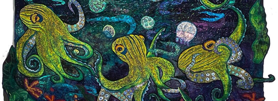
I’m not interested in tennis shoes, but I do want to see what happens if I put repetitious octopuses in bright colors together. This is the first octopus. The plan is to put four together. I’m not sure if I’ll use rows or weave their tentacles together.

The colors on the octopuses echo the hand-dyed fabric I’m using. They have a light source that shifts the colors through the tentacles.

Here are three more in different states of completion. When we’re done, we’ll see what pops up.

Going Straight: Stretching into Different Stipple Patterns

I’ve been working on the octopuses for around five months. There are seven in all, five finished. I’m pleased to say they make a good start for a show.

But I don’t want quilts that look like the same pieces, only in different colors.

What defines a work? Certainly subject matter. Certainly color. But textures also make pieces stand from with each other.

I’ve leaned heavily into oranges and blues on this collection, but I think there’s a good range of colors. The background is always the color of your sky, the mood of the piece, and its definition

The octopus’s garnet stitch texture connects the grouping.

Something more subtle separates them.

The stipple treatment establishes the movement of the water, but it also visually separates the pieces from each other.

Confession. Left to my own, I have three stipples I use. I really felt I needed to stretch a bit here, particularly because I want the quilts in this series to stand up as separate works.

Version 1.0.0

Leah Day’s book, 365 Free Motion Quilting Designs has become a go-to reference for me. I don’t feel a need to copy her designs, but it’s full of a lot of stimulating ideas. It’s one of the few books I store right by my machine. It’s a worthy resource. I turned to it for some different stipple ideas.

I almost never do straight lines in my work. I’m not very good at them. But I love the bubbles and stripes here. It’s almost like wallpaper for the quilt.

Here are details of the other quilts, showing the different stipples.

Leah’s book is a lovely springboard into other possibilities. It’s available on Amazon

So I went straight on one of them and survived. Maybe I can do straight lines.

Lace Jellyfish, Step by Step

I wanted three-dimensional transparent jellyfish with opaque areas.

This technique depends on the stabilizers. But there are a number of different stabilizers that will work. They are made for very special purposes.

Stabilizer Sandwich

This time I made my stitching sandwiches out of a layer of Totally Stable for my drawing, Paper Solvy, lace or organza, and Badgemaster, All the stabilizers except the Totally Stable will dissolve out of the work. What I want when I’m done is a clean outline and edge, with some white areas and some transparent.

You can make an image just with your stitching. But you have to make sure all of the stitching connects with itsself or it will fall apart when the stabilizers are gone. Instead, I used commercial nylon lace and organza as the fabric

What do those stabilizers do?

  • Totally Stable: Iron-on, tear-away. Good surface for drawing a pattern
  • Paper Solvy: Paper-like, tearaway that provides stabilization without a hoop that will dissolve in water.
  • Badgemaster: Heavy-duty corn starch topping that dissolves in water.

The order of the sandwich was, from top to botton, Badgemaster, organza or lace, Paper Solvy, and Totally Stable. Snce we’re working upside down, Totally Stable drawing layer is on top where we can see it.

The threads I chose were a polyester white top thread and a Cristalyn white metallic in the bobbin. The metallic is more fragile, and that is why I have it in the bobbin. I chose white because the background is so dark, and I wanted them to shine out. All of the stitching is done from the back.

You’ll notice that I used 2 different magic markers for my drawings. That was an error. Even with all the stitching, the marker colors showed through. I don’t mind either the blue or the orange, but they don’t work together in the same piece.

The Stitching

These are all stitched free motion from the back.

Stitch Process

Outline the image. Freemotion zigzag.

Remove any of the Totally Stable parts you want to be see-through. Score them with a pin and pull them out.X

Use a straight stitch to texture the jelly.

Remove the excess Paper Solvy and Totally Stable from around the pieces.

Stitch around the edge with a zigzag to stabilize them.

Cut away all the excess stabilizer

I edge-stitch again just to give them a more solid edge.

The Paper Solvy and the Badgmaster need to be dissolved in hot water.

Badgemaster is starch. So I took the trimmed off scraps,dissolved them in water, and dipped the jellies to give them that hard starched edge. I dried them on freezer paper. Notice that the orange jelly is the one that was drawn in orange. I need to rethink my mmarkers.

We’re ready to roll with the 3rd pin up on Octopus 5. I believe we’ll call it, Rock, Paper, Shark.

Why My Art Isn’t My Hobby

Years ago, a mentor of mine told me that when you are young, you pick up everything like you’re in a candy shop. What defines us in the end is not what we take up, but what we put down.

Don wearing my crocheted wing. Don is a good sport.
crocheted Cthulu head mask

All of these things are artistic. They’re fun. They fill up time. None of them is art.

I believe in art. I believe everyone is an artist. I believe it to be inherent to being human. Art is how we make sense out of our experiences. It reaches way past media. We work it out in music, in painting, in sculpture, in fiber, or in writing. We retell our stories. Within the retelling, we craft our world into something we can live with. We recraft ourselves. If one path closes, another opens to carry this on. I balance between writing and my art. In purpose, they are essentially the same.

I cant say I understand my art. I sometimes do in time. I know an image gets in my head and I have to work with it. Once I have, something in me settles. I’ve changed myself by engaging with the image.

Everything eventually turns into work. There’s the day you have to bind something. The day 6 small quilts are due, and none of them finished. It may be fun. It may not. But you need to get it done.